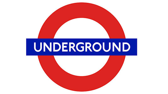
 This is the original Johnston font designed in 1916
The typeface used on all Transport for London signage has become an iconic retro font, but it's set to change for the first time in 100 years next month. Designed in conjunction between TfL and what people get up to on the underground, with Londoners spending up to a year of their lives on the tube, but even their trained eyes might not spot this understated change.
By working with the principles of the font's original designer Edward Johnston, Monotype could create a digital wordmark that builds on the typeface's distinctive DNA. The result is Johnston100, which can be seen below.
 The new Johnston100 typeface was designed with social media in mind
Jon Hunter, TfL Head of Design, explains that the new font was created to ensure the company's identity is consistent across all future branding platforms.
"As social media has become more important, hashtags and at signs are more important – Johnston never designed those because they were never needed," he reveals.
The Type Director at Monotype, Nadine Chahine, adds that "We were able to capture the contemporary trend and the fashion of having something very light and very elegant, but because we are still using the original structures, we were able to maintain the soul of the typeface."
Commuters will initially see Johnston100 on printed materials such as posters and maps. It will also be used on the station signage for the new Crossrail Elizabeth line which is due to open in 2018.

