Helmo / Palais de Tokyo. License: All Rights Reserved.
Cover, Palais #15. Designed by Helmo for Palais de Toyko.
A couple of weeks ago I compiled a list of 12 typefaces for 2012 which you can check out over at http://linefeed.me/. No.12 was a curious, custom made typeface created by French graphic design studio Helmo. Created for exclusive use by the newly extended and reopened, Paris-based contemporary art "palace", the Palais De Tokyo.
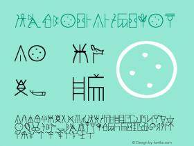
The idea behind the typeface is quite simple, a series of"'punch-cut" holes line up to make letterforms. Through Helmo's execution, this simple idea has been splintered into a typographically-led identity system with seemingly infinite varieties.
The Palais de Tokyo's inhouse magazine, suitably named Palais, is a good starting point if you want to investigate Helmo's distinctly non-linear approach. Here you can check out how the Palais typeface gently degrades as letterforms 9 dots high are stripped back to only 4 dots high and then mixed together.
Other tricks employed include adding "outlines" to the letterforms to create a "bumpy" effect similar to Julia's Riso typeface developed for The Invisable Dot. The dots that make up the letterforms are also altered in shape and size or even filled with patterns and similar motifs.

Helmo / Palais de Tokyo. License: All Rights Reserved.
Inside spread from Palais magazine #15.

Helmo / Palais de Tokyo. License: All Rights Reserved.
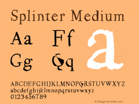
Examples of the Palais typeface designed by Helmo for exclusive use of the Palais de Tokyo.

Helmo / Palais de Tokyo. License: All Rights Reserved.
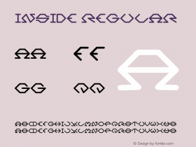
Spread from Palais magazine, #16.

Helmo / Palais de Tokyo. License: All Rights Reserved.
Spread from Palais magazine, #16.

Helmo / Palais de Tokyo. License: All Rights Reserved.
Palais typeface by Helmo for Palais de Tokyo in 4, 7, 9 and 9 Bold interrations.