License: All Rights Reserved.
Posted as part of a little survey about websites for conferences on typography and graphic design – how do these specialist events present themselves typographically, in 2013?
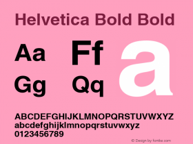
AGI Open demonstrates that having novelty webfonts in plenty styles is not a prerequisite for a striking and contemporary event website. Spin specified system Helvetica Bold only, white on black, in big and bigger. Maybe it's not cutting-edge, but I found it appealing to look at and easy to navigate. The responsive design with the tiles and the flat buttons feels very app-like. The imagery is of outstanding quality.
Webfonts: ✗
Designer credits: ✓
Typeface credits: ✗

License: All Rights Reserved.

License: All Rights Reserved.

License: All Rights Reserved.

License: All Rights Reserved.

License: All Rights Reserved.

License: All Rights Reserved.