Fresh back from three consecutive conferences in as many countries and as many weeks – I'll have reports up later for ScreenFonts. I have come to rely more on valuable external resources for writing these. Requesting micro-interviews with designers of posters that intrigue me has become a second nature already, and recently I discovered Posterized Propaganda. This series by Jared Mobarak on The Film Stage provides me with extra background information on specific posters. As Jared's analysis is more generally focussed on design and efficiency, I like to think my type-centric reviews are complementary to his. If you are a fan of movie poster art I heartily recommend reading through his monthly updates. And last but not least it looks like The FontFeed will occasionally collaborate with Fonts In Use. The scope of ScreenFonts is too limited for thorough, in-depth examinations of the histories of the typefaces used in the movie posters – this would easily make the posts twice as long. Browse through the rapidly growing collection of movie posters on Fonts In Use, where you'll already find entries for The Great Gatsby and Frances Ha, two posters to be discussed in the next episode of ScreenFonts.
It's fascinating to notice how advancements in font technology have changed our expectations. Although the handwritten movie title nicely matches the illustrated portrait on the movie poster for Andre Gregory: Before and After Dinner, most people will have the impression something about the letters is not quite right. Not so very long ago the letter forms of Dear Joe 1 by Joebob Graphics would have been perfectly acceptable. These days however many professional fonts mimicking quick, scrawling handwriting are available in feature-rich OpenType format with automated swapping of alternate glyphs. To our now slightly more sophisticated eyes the identical character shapes of repeating letters seem jarring and ruin our suspension of disbelief. We stop seeing this as something done by hand; it becomes unmistakably a mechanical artefact.
And here's another design that defies our typographic expectations. For a movie called Tattoo Nation one would expect to find intricate and swirly tattoo-like lettering – see for example Alejandro Paul's Piel Script – on its movie poster. Instead the design goes for the neon lettering found on the store fronts of tattoo parlours.
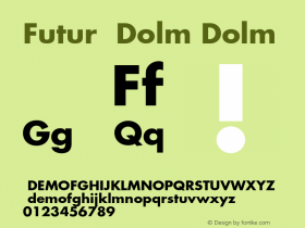
The teaser posters for Trance are a nod to its storyline. After double-crossing the gang helping him with an art heist, the fine arts dealer played by James McAvoy feigns amnesia. Gang boss Vincent Cassel employs psycho-analyst Rosario Dawson to hypnotise McAvoy in an attempt to recover the missing painting. This is referenced in the phrases set in Futura and the hypnotic concentric circles revealing the faces of the three main characters. Nevertheless these designs are a little too timid for my taste.
Same goes for the UK character posters. Here the "action movie" atmosphere of the high-contrast images somewhat contradicts the artsy psychological mood of the concentric circles with gradients. The cool yet inconsistent look drives home that these posters are mostly style over substance.
The rigidly constructed sans serif used for the movie title is Foundry Gridnik. It is an expansion and digitisation of Dutch design legend Wim Crouwel's lettering on his iconic Number Postage Stamps for the Dutch PTT, in circulation from 1976 to 2002. Nik Thoenen created a faceted design in the same vein called Blender for Gestalten.
The Martha Marcy May Marlene, Shame, and Sound of My Voice in previous episodes of ScreenFonts. It looks as if the computer ingested the poster image and regurgitated it as a cacophony of digital glitches and screeching colours, distorting and amplifying James McAvoy's primal scream to unbearable extremes. The unsettling design is raw, uncompromising and powerful; the arresting poster a perfect fit for the movie – check the red band trailer (not for the squeamish!) if you don't believe me. Here the face supporting Gridnik is the classic American Gothic News Gothic.
Although the poster for The Brass Teapot is equally colourful, the contrast with the previous design is rather extreme. The digitally generated insanity makes way for a an almost quaint hand-made atmosphere. The collage-like image successfully visualises the theme of the film, telling a complete story by assembling carefully selected elements into a lovely tongue-in-cheek composition. I only wonder if this may have looked even better as an actual collage, with visible cuts, folds and tears to give it a little more texture.
This alternate poster expands on the collage theme, and proves to be as efficient as the first one in setting the mood for the film. The circular arrangement of flowers, feathers and dollar bills around Juno Temples' head lends the artwork a kaleidoscopic feel.
The vintage-looking straight-sided sans for the movie title is Tasse Extended. Developed from Topic – also known as Steile Futura – it is a typographic motif Paul Renner himself explored in the mid nineteen-fifties. Topic's more compact cousin Futura Display is another design by the father of Futura exploring similar letter forms. Guy Jeffrey Nelson modernised the idea, expanding Topic into an impressive twenty-member family of four weights in five widths. The pioneer of digital type design Zuzane Licko had a go at this typographic model too, merging it with the classic Anglo-American gothic sans model to create the economic and highly readable Solex.
The artwork for Simon Killer revisits the typical modernist style of film posters from the 70s, beautifully updating it for today's audiences. The reflection in the red eye is intriguing – is the couple reflected in the eye Simon in a loving embrace with the prostitute he gets involved with? It could also be something more sinister: Simon's eye observing the Victoria/Noura with one of her clients.
The stylish design with asymmetric typography was created by Brandon Schaefer. Schaefer started making posters of older films for himself years ago. Gradually, over time, he got the opportunity to work on re-release marketing for classic films. Within the past year he has spent more time working on independent releases. Part of that includes a fruitful relationship with IFC Films. Simon Killer came about through them.
The concept for the design really spilled out of the initial discussions we had about the film, and how the colour transitioning that would crop up throughout mimicked what you'd see when you'd quickly close your eyes. You know, those bands of colour that you see even though your eyes are shut. Simon's work in college specifically dealt with the eye and it's relationship to the brain, so those two kernels set some groundwork for the imagery. I've enjoyed some of the interpretations people have thrown out about it, so I don't want to delve too much into the meaning – my editor at film.com has a particularly good take on it. This is probably the only project I'll say this for.
Much of the artwork rests on 70s film poster conventions (or, at least, the framing and placement that was more common during that time) and ITC Avant Garde Gothic Bold complimented that while playing off the more forceful nature of the main character. Another poster that was in the running but didn't make it out of the gate was set in a much thinner weight of the same font. While it played off some of his more meeker traits, it didn't really connect with the direction we wound up going in.

I find this spoof PSA poster for It's a Disaster, also by Brandon Schaefer, very entertaining. Futura Bold and Extra Bold spell out ridiculous advice on how to behave in the face of disaster. The folds and creases add a hint of authenticity to the design. My only gripes are the straight apostrophe in the movie title, and the "12" in the release date could use some kerning. This alternate poster definitely is a lot better than…
… the main poster. Can we all please agree that we've seen way too many posters referencing or parodying the iconic "Uncle Sam" U.S. military recruitment poster by J.M. Flagg? It's not clever, surprising nor funny anymore. Seriously.
Clever and surprising is what I call this Super 8 – tilting the image sideways still manages to take me unawares. In this design it also gives several extra layers of meaning to the image, depending on your interpretation. When viewed vertically, Chadwick Boseman's body posture while sliding in the base makes him look like a super hero lifting off to the skies and rising above adversity. Yet when you pay attention to his facial expression, the image tells a different story altogether. You see him struggling, either hanging on for dear life when circumstances are trying to bring him down, or trying to emerge from metaphorical quicksand suggested by the dirt kicked up by is slide.
ITC Machine for the movie title is an obvious choice as it clearly conveys strength and resolve. The designers could also have gone for another, less common collegiate athletics face; a typical baseball script may not have been a strong enough statement. The supporting face is the wide sans serif ITC Blair.
While the weathered and textured compact grotesque, possibly Helvetica – to create a delightful layered image. As Kellerhouse, Inc. has become synonymous with left-field innovative design in film collaterals, all commenters on the internet are presuming this is their work, even if no one could find hard proof for this. I have reached out to Neil Kellerhouse for confirmation, but sadly this time the very in-demand designer couldn't reply (yet?).
There is a clever typographic pun in the Woody Allen has used this typeface exclusively for all his title sequences since his conversation with Ed Benguiat. Yet Gotham has no connection to Paris whatsoever. I wouldn't go as far as suggesting the use of the alphabet inspired by the original signs for the Parisian metro or a similar Art Nouveau face, but a link to Paris would have been a nice touch. They even could have used its typographic namesake.
Another typographic pun can be found in the movie poster for The Numbers Station. The B in "Numbers" was replaced by the number 8 in the movie title set in Microgramma / Eurostile Extended. The designer could have ventured further as it is possible to substitute additional letters with numbers to achieve a more adventurous typographic image. I would have tried turning one or both of the Ss in a 5, the I in a 1, and maybe even the A in a 4. That single 8 just looks too sad and lonely to me.
By the way, urgent message to the Photoshop nutcase who airbrushed both actors' faces within an inch of their lives – step away from the computer. Now. I mean it.
The third typographic pun in a row is on the movie poster for The Reluctant Fundamentalist. Here the C in "Reluctant" was changed to a crescent and star from the Pakistani flag, of the main character's family's homeland. The geometric sans serif is FB Eagle, which realises the ideas behind Morris Fuller Benton's famous titling face, Eagle Bold, the symbol of American recovery, drawn in 1933 for the National Recovery Administration.
Jay Shaw a.k.a. Iron Jaiden designed an gripping alternate poster for Graceland. The hand-drawn artwork visualises the story in a thoughtful, sensitive way. When a kidnapping goes wrong, a desperate father risks everything to save his daughter from the men who hold her captive. Darren Bradley explains on Posterocalypse that "(…) Shaw has definitely captured the chaos, uncertainty and desperation with his sparse design." My take on this design is that the outstretched hands symbolise the father and the abductors, both sides trying to grab hold of the daughter. Her body posture can be interpreted in two ways – either a foetus position, or a trapeze artist frozen mid-somersault between the two people responsible for catching her. Both possibilities imply a heart-wrenching vulnerability. The hand-lettering is consistent with the illustration. Beautiful work.

We switch from quiet black-and-white to colourful baroque for the last posters of this episode. The visual style of the movie poster for An Oversimplification of Her Beauty comes across as an ethnically flavoured actualisation of Jügendstil, more specifically the work of Gustav Klimt.
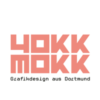
This alternate design however interests me more. Customised Futura capitals are overlaid on a dark, slightly distorted portrait of the two main characters. The customisation works very well – the geometric capitals of Futura lend themselves well to additions and omissions (see also FF Yokkmokk). The resulting typography is an intriguing blend of African art and Post-Modernism.
