Source: http://www.astridstavro.com.License: All Rights Reserved.
As stated in Astrid Stavro's website:
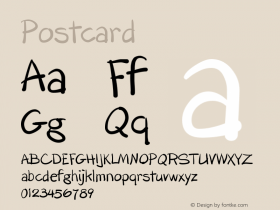
The catalogue for an exhibition based on the translation of Rodoreda's The Time of Doves into different languages has been designed in a format that conjures up the well-travelled nature of Rodoreda's words. Eschewing the stay-at-home traditional book format, the catalogue is designed as a packet of eleven postcards, each featuring a different language translation of the opening paragraph of The Time of Doves. Each card is colour-coded to differentiate the languages and relate to a chart breaking down the distribution of translations of Rodoreda's work around the world. Each postcard is set in a font that reflects a country's language, for example Didot for France and Baskerville for the UK. There is also an A2 fold-out poster featuring covers of forty-eight editions of Rodoreda novels in different languages form the 1960s until now.
I find interesting this idea of finding a typeface that represents a language of a country. There are still some typefaces left to identify in the non-latin scripts. So if you know them, please give me a hand.

Source: http://www.astridstavro.com.License: All Rights Reserved.

Source: http://www.astridstavro.com.License: All Rights Reserved.

Source: http://www.astridstavro.com.License: All Rights Reserved.

Source: http://www.astridstavro.com.License: All Rights Reserved.