
Source: http://theplant.co.uk.artwork and image by The Plant. License: All Rights Reserved.
London-based agency The Plant recently designed a new look for the English family-owned "food-to-go" company EAT:
EAT create great food-to-go with an attention to detail and curiosity that's unique in their sector. Staffed by a team of committed foodies their menu is a constantly changing offer of old favorites and new treats. Every ingredient and recipe is carefully chosen and it's this sentiment of "Handcrafted" that defines the essence of the EAT brand.
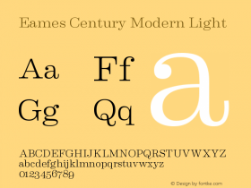
A crafty, considered attention to detail — and a refreshing no-bullshit attitude promising "real food", and with style too — comes across beautifully in the identity that relies largely on various styles ofEames Century Moderngiven ample space and framed in various borders, mostly in white on a variety of flat color backgrounds. Colors are also chosen to represent different product categories; product details and ingredients are openly and proudly communicated. The project includes packaging, shop signage and posters etc., but also digital signage for in-store menus — see The Plant's beautiful project showcase.

Source: http://theplant.co.uk.artwork and image by The Plant. License: All Rights Reserved.

Source: http://theplant.co.uk.artwork and image by The Plant. License: All Rights Reserved.

Source: http://theplant.co.uk.artwork and image by The Plant. License: All Rights Reserved.

Source: http://theplant.co.uk.artwork and image by The Plant. License: All Rights Reserved.

Source: http://theplant.co.uk.artwork and image by The Plant. License: All Rights Reserved.

Source: http://theplant.co.uk.artwork and image by The Plant. License: All Rights Reserved.

Source: http://theplant.co.uk.artwork and image by The Plant. License: All Rights Reserved.


