
Source: http://simplybrown.net.Photo: Tim Brown. License: All Rights Reserved. Artwork by Tim Brown.
Simply Brown logotype.
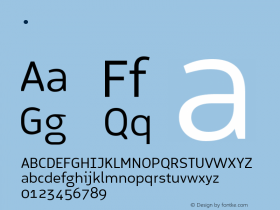
This is the identity and website for my wifeD'Amico Regattaand I worked around it. Our goals were clarity and honesty (Bernina), warmth and fun (Regatta). More about the type palette below.

Source: http://simplybrown.net.Photo: Tim Brown. License: All Rights Reserved. Artwork by Tim Brown.
Crop of the homepage. Kepler Semicondensed for headings, Bernina for text and subheads.

Photo: Tim Brown. License: All Rights Reserved. Artwork by Tim Brown.
First type exploration. On the left, PLINC's Copeland Milo with Rooney Sans (a lovely pair, but not the right choice for this project). On the right, final choices (except here, Kepler Regular at standard width).

Source: http://drbl.in.Photo: Tim Brown. License: All Rights Reserved. Artwork by Tim Brown.
Slight modification to Regatta. Also, lifted the foot of the 'i' and rounded/bent parts of the blocky logo square. All modifications in this gif: http://cl.ly/SRie

Photo: Tim Brown. License: All Rights Reserved. Artwork by Tim Brown.
From top to bottom, D'Amico Regatta, Kepler Semicondensed, and JAF Bernina Sans. Kepler roughly shares Regatta's contrast, vertical stress, and angled top serifs — enough to carry the logotype's personality downward into the composition. And this width and weight of Kepler, Semicondensed Medium, has a rhythm similar to Bernina. If this combination is successful, Kepler is the key. Bernina does its job quietly and unobtrusively, its round dots, tailed 'a', two-story 'g', and curvy 'y' contentedly similar to the corresponding shapes in Kepler.
