
Source: http://www.quora.com.License: All Rights Reserved.
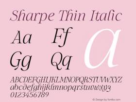
TheLe Monde Courrierand made many modifications including widening the 'Q' and adding a custom tail that was perhaps inspired by the font's tilde (see Cuban Council's exploration below). The curved tails on the 'u' and 'a' were replaced with foot serifs derived from the 'r' and the arch on the 'r' was simplified. They also dramatically closed in the counter on the 'a' (for some reason I can't comprehend). The letter-spacing was also tightened quite a bit, and I would argue the 'uor' is a bit too cozy. Finally, Le Monde Courrier's soft corners were sharpened all around.

Source: http://www.cubancouncil.com.License: All Rights Reserved.
