
Source: http://www.guteaussichten.org.Gute Aussichten. License: All Rights Reserved.
A 16-pages magazine accompanying Gute Aussichten, the annual media and exhibition project that promotes young photographers in Germany.
The designers of Bureau Mario Lombardo are not shy of all caps. Also, they are not afraid of mixing fonts, in various weights and various sizes.
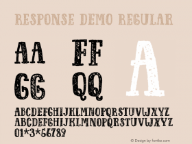
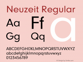
The magazine uses both weights ofErbar, which only covers the condensed weights of Jakob Erbar's classic geometric Grotesk from the 1920s. Neuzeit is another German Grotesk that goes back to the late 1920s. Judging from the name ("modern times"), Wilhelm Pischner's design (1928) can be regarded as Stempel's response to Bauer's highly popular Futura (1927).Neuzeit Sis a remake by Linotype, optimized for large bodies of text and first released in 1966. "[T]he 'S' stands for Siemens, who used the typeface at that time as part of their corporate design." [Times New Roman.

Source: http://www.guteaussichten.org.Gute Aussichten. License: All Rights Reserved.

Source: http://www.guteaussichten.org.Gute Aussichten. License: All Rights Reserved.
Detail: Erbar Bold Condensed in all caps for the name of the photographer and the school as well as for the year, in three contrasting sizes. The title is in Times New Roman, again in all caps. The English translation of the school's name is in Neuzeit S Book and the names of the supervisors in Neuzeit S Heavy.

Source: http://www.guteaussichten.org.Gute Aussichten. License: All Rights Reserved.

Source: http://www.guteaussichten.org.Gute Aussichten. License: All Rights Reserved.
Cover