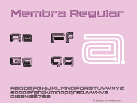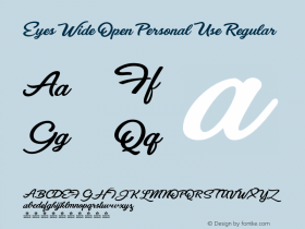
Two months on, it's still impossible to wrap my head around the fact that obituaries before on The FontFeed, but this one had me paralysed. Even though we met in person only a couple of times, I considered Peter a dear friend, and I think it was reciprocal.

Peter Bruhn with baby Adrian. Photo by Lotta Bruhn.
I met Peter, virtually, around 2002–2003 on the thriving online community of type designers, typographers and other assorted type geeks that is Typophile. He was one of the regulars, a valued member that contributed to the debate in a positive and often humorous way. Little by little I learned to know more about him. Peter was one of the numerous self-taught type designers from the grunge wave who discovered Fontographer in the early 90s and simply dove in – fearless and with eyes wide open. What began as a side activity turned into something more serious when Peter established his Fountain type foundry in 1993. Fountain was one of the earliest independent type foundries, and the first Swedish one to carry typefaces by other designers as well. At the turn of the millennium he took not one but several big plunges – he married Lotta, started a design partnership with her under the name The Bruhn Family, and bet everything on Fountain. He never looked back.
As we got to know each other better we found out we were born the same year, and were both musicians. Besides two stepdaughters from Lotta, he had a son Elliott who was three years younger than my own son Randall and five years younger than my daughter Eliza. In 2004 we congratulated each other with the birth of his son Adrian and my daughter Nona. In that respect the internet is a bizarre thing – by the time we finally met in person at TypeCon2005 in New York City it felt like we had known each other for a long time. All it took was the warmth of his big bear hug to remind myself how much I liked and loved that man; it was an immediate connection between like-minded people.
This Christmas – song from Peter Bruhn on Vimeo.
We saw each other only one more time after this, at Robothon in 2009. Afterwards we e-mailed each other, vowing it would not take another four years before seeing each other again. Little did I know… Peter and I communicated through chat, me often making fun of him for his sloppy typing. We mostly talked about type-related stuff, exchanging ideas and asking each other for advice. But we also discussed our family lives, sharing our delight at raising young children and our concern at having teenagers. At my presentation at ATypI 2005 in Helsinki I wore a T-shirt with a Mercury 'g' in protest against a corporate face that pirated his design. He invited me to contribute the introduction to the delightful and hilarious Fountain specimen booklet collecting spam messages, and I wrote and edited texts for some of his type releases.
I don't know inhowfar I can call myself a close friend of his. How much physical proximity does one need to qualify as such? Maybe that's not relevant; all I know is that his absence has left a void in my life. Heck, even my daughter Eliza contacted me, shocked about his passing, and the only way she knew Peter was through the stories I sometimes told my then-wife and children. So I can only imagine what it must be like for his friends and family, the people who actually lived with him and loved him.
Peter's passing has also left a considerable void in the type world. Everyone I talk to shares similar stories about his warmth and generosity, his helpfulness and good humour. He was continuously growing and evolving as a type designer. Peter's latest type family – the Satura Suite, an ambitious, wildly imaginative collaboration with Göran Söderström – hints at the great designs he still could have given us. Yet, as much as he was a type designer and foundry owner, Peter was a mentor and a coach, helping fellow designers improve their typefaces. He selflessly gave his best for others, never asking anything in return and staying humble. His greatest quality unfortunately was the reason why he had so many unfinished typefaces in his proverbial drawer, typefaces which will never see the day of light.


Peter working on Adrian, a strong text serif face inspired by Frutiger's Breughel and named after both his youngest son and Frutiger (top), and a family shot of Peter and Lotta with their two sons and their dog (bottom).
Whenever I need to explain to students that behind every typeface there is a designer who has a passion for type design and helps provide for his family, I use the two pictures above that Peter once sent me. One has him working on a font at his computer; the other shows Peter, Adrian, Elliott, Lotta, and their dog – a lovely family scene in the sofa. Because Peter was a true family man with a big heart and an warm sensibility for everyday beauty, as attest his photos on Flickr, Instagram and Tumblr, and his videos on Vimeo.
My heart goes out to Lotta and to their children, who have to miss Peter so prematurely. It is heartbreaking to realise Adrian and Elliott won't have their father to guide them through their teenage years. I hope that gradually the loss will become bearable, and that Peter will live on in their hearts and minds. He definitely will in mine, because he left an indelible impression on me.
If you want to know more about Peter and his work read Stephen Coles' heartfelt tribute on Typographica, and the memories shared in the comments. Göran Söderström's touching remembrance is well worth passing through Google Translate.
