
Source: http://toormix.com.License: All Rights Reserved.
"Toormix New Papers is a self promotional editorial portfolio containing a selection of projects developed at the studio from 2007 to 2009."—toormix.com
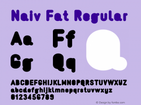
The rounded DIN-like typeface isNaiv, designed by Timo Gaessner (now running Milieu Grotesque) and released with Gestalten in 2006. It seems to have disappeared from the market. There was also Naiv Text, with a double-storey 'a' and an 'O' and 'Q' without a curl in the counter, as well as the fattened Naiv Fat, with filled-in counters. You can still see them on Identifont.

Source: http://toormix.com.License: All Rights Reserved.

Source: http://toormix.com.License: All Rights Reserved.

Source: http://toormix.com.License: All Rights Reserved.

Source: http://toormix.com.License: All Rights Reserved.

Source: http://toormix.com.License: All Rights Reserved.