Source: http://images.google.com.License: All Rights Reserved.
Curitiba, capital of the state of Paraná, has an unique relationship with the Helvetica typeset.
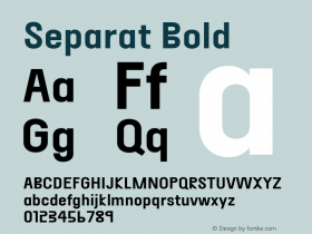
Through the years, Curitiba is treated as a model for urbanization and, especially, public transportation. With intense awareness campaigns in the 90's, Curitiba is very clean for the standards of big cities. The success for these campaigns came with the use of great design. The use of Helvetica in the campaign "Se-pa-re" (Portuguese for Separate) shows an understanding that design can facilitate communication of ideas to people.
Along with these campaigns, Public Transportation of Curitiba is, by far, where Helvetica is most used. Everything between the IDs of buses and their routes, through notices inside the buses and bus stops are written in Helvetica. Thinking, again, about the best clarity that the font has.
The street signs are an use of Helvetica Rounded, and it shows a clean design and a great place for advertisement. Created by Plamarc, these signs became another unnoticed trademark of Curitiba.

Source: http://images.google.com.License: All Rights Reserved.

Source: http://images.google.com.License: All Rights Reserved.

Source: http://images.google.com.License: All Rights Reserved.

Source: http://images.google.com.License: All Rights Reserved.

Source: http://images.google.com.License: All Rights Reserved.