
Seattle Met. License: All Rights Reserved.
In 2012 Seattle Met's food and drink editor, Allecia Vermillion, had the fun idea of a yearbook for beer. The 11-page feature celebrated the "new school of Seattle craft beer" by awarding classic honors and riffing on the periodic table.
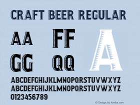
I tend to stay away from layout gimmicks but this was impossible to resist. Font Bureau'sBiscottiandBradley Initialslead the way. The opener acts as a kind of cover, inspired by vintageAmerican yearbooks. For the spreads, I stuck to a reduced color palette and strict range of type sizes, so that most of the energy would come from imperfect alignment and overlapping elements — many yearbooks were made by students and are full of quirks. The photography caps off the concept; all of the subjects were willing participants and photographer Patrick Kehoe nailed the look.
I recommend anyone striving for a retro look to seek out unusual combinations of typefaces. Don't rely on fonts exactly from the genre you're emulating — unless the product needs to be historically accurate — instead, understand your content and express a feeling. A touch of contemporary typefaces will balance the design, keep you away from copycat mode, and help your work ring true.

Seattle Met. License: All Rights Reserved.

Seattle Met. License: All Rights Reserved.

Seattle Met. License: All Rights Reserved.

Seattle Met. License: All Rights Reserved.

Seattle Met. License: All Rights Reserved.

Seattle Met. License: All Rights Reserved.