FontFont Release 49 featured four new releases, three of which I already discussed on The FontFeed. FF Unit Slab is the most recent of FF Dagny; and FF Kava is a redesign from the ground up of Yanone's popular freeware font family Kaffeesatz. So I still owe you the last new design in the list, FF Duper by Martin Wenzel.
Updated with FontTester for FF Duper OT

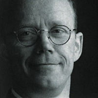
Martin Wenzel sporting one of his FF Duper shirts.
Martin Wenzel was born in Berlin in 1969. After finishing school in 1987, a friend introduced him to CitySatz, the well-known service bureau in Berlin. There he completed his training in 1990 and became the first desktop publishing typesetter in Germany to use an Apple Macintosh (1991). That's where I first ran into Martin in August 1991 – I did a month of training at Erik Spiekermann's MetaDesign which was housed in the same building as FontShop International and CitySatz who were then working on the 1992 FontShop Catalogue. That year Martin released his first typeface through FontFont, the modular compact sans FF Marten, and contributed to Neville Brody's Fuse 3 "(Dis)Information" with F InTegel, a FontStruct toolbox avant-la-lettre.
Martin's interest in type design was sparked, but at the same time he felt limited. He left CitySatz after after three years in 1993 and enrolled in the Type and Graphic Design department – the precursor of Type]Media – at the Royal Academy of Fine and Applied Arts (KABK) in The Hague. During his KABK years he designed FF Rekord, a rough sans featuring audio dingbats; FF Primary, a layered angular sans that allows for three-dimensional effects, and its experimental cousin F Schirft for Fuse 6 "Codes". Upon graduating in 1998, Martin became employed at Buro Petr van Blokland + Claudia Mens in Delft, the Netherlands, where he lived until 2005. FF Profile, his narrow sans serif text face, took four years to produce and was released in 1999. The family comes in five feature-rich OpenType Pro weights plus matching italics, with over 1,000 glyphs per font. It was awarded with a Certificate of Excellence at the Type Directors Club TDC2 2000 competition. Martin now runs MartinPlus, his own type and communication design studio in Berlin, working on a diversity of type design projects and combining his typographic knowledge with his long years of experience as a graphic designer.
And now comes FF Duper, a hand drawn text sans. It was designed by tracing print-outs of FF Profile, and then cleaning up and balancing out all the glyphs. The typeface has a fascinating feature – an automated loop that alternates three variants per character for a truly hand written look. Ivo Gabrowitsch posted an interesting piece about the making of FF Duper on I Love Typography including a video which has Martin explaining the origin and creation of the typeface.
Video originally featured on I Love Typography
Late last summer Jürgen Siebert interviewed Martin Wenzel for FontBlog. As it was originally published only in German I decided to do a (rough) translation and offer it to our readers as well. Before we go on I'd like to say one thing about the German translations I do for Jürgen's posts. I don't speak German, so all I have to go on are a fleeting resemblance between my native Dutch and German, a good dictionary, English as my third language, and a lot of patience. Please forgive me any inaccuracies or misinterpretations.
J Ü R G E N| How did you come upon the idea to create an automated typeface?
M A R T I N| The original idea for this typeface sprang up 10 years ago – I wanted to design a spontaneous looking hand written typeface whose appearance wouldn't remind the viewer of the computer. After one and a half years I decided to start on this project in earnest.
J Ü R G E N| This typeface heavily relies on OpenType technology, so I suppose its increasingly wider spread and acceptance spurred you on?
M A R T I N| Indeed, OpenType provides crucial support for the effect. Its functionality is indispensable for producing fully automated character substitution.
J Ü R G E N| FF Duper reminds me of two other typefaces, and seems to combine the best of both worlds: FF Kosmik and Comic Sans.
M A R T I N| I don't really see the connection with Comic Sans. That is a constructed typeface, I believe even monoline, so it doesn't have any dynamics in the strokes. My design is directly derived from my own hand writing, more exactly three times four is twelve versions of my hand writing.
J Ü R G E N| What do you mean?
M A R T I N| Well, FF Duper consists of four weights – Regular, Italic, Bold and Bold Italic. In order to obtain a lively, authentic text appearance I drew the complete character set on paper three times over for each of the four weights.
J Ü R G E N| For real? Even the punctuation marks and accents? That's a couple of thousands glyphs!
M A R T I N| More precisely 5,700. That is also the reason why the whole project eventually took twelve months instead of twelve weeks. But I really believe it was worth the effort.
J Ü R G E N| In what way is your loop technology different from the Flipper technology in FF Kosmik?
M A R T I N| As far as I know the Flipper technology invented by Erik van Blokland – a pioneer and an inspiration to us all – alternates the three shape variants for each glyph consistently, like 1 2 3 1 2 3 1 2 3. As you can see in the example below the German word "Messschraube" produces a 100% random appearance for the three consecutive letters "s", however the German word "Messestand" only achieves a 66,7% randomness, as the third "s" in the word is identical to the first one.

Flipper technology at work in FF Kosmik.
The substitution technique used in FF Duper differs from FF Kosmik in that it uses an algorithm that distinguishes vowels from consonants, and produces two separate cycles for them as demonstrated below. What's more – you'll also notice that although the three consecutive "e"s are separated by other letters they are identical in the FF Kosmik example, while they are all different in FF Duper.

Custom character loop in FF Duper.
Testing revealed that this considerably reduces the chances of having sequences of identical character shapes; insofar that our eye doesn't notice any more that it is a computer font, and is fooled into thinking the text is really hand written. Additionally the character cycles ignore word spaces which horizontally stretches the loops even more. The end result is that my letter carousel turns the largest possible rounds.
J Ü R G E N| With what OpenType feature is this effect achieved?
M A R T I N| The Contextual Alternates* feature takes care of this. By the way the original code which counted barely six lines increased tenfold as soon as I converted the single loop into the two separate loops for vowels and consonants.
J Ü R G E N| I think we should also briefly touch upon the character set of FF Duper which is quite expansive.
M A R T I N| That is correct – besides different sets of numerals, fractions and an extended ligature set FF Duper also contains arrows, bullets, labels, and other refined typographic treats.
J Ü R G E N| And it also has a talent for languages, isn't it?
M A R T I N| Indeed – the Pro version of the typeface supports 64 languages.
J Ü R G E N| Thank you for this interview, Martin.
| (*) | I discovered that if you have Contextual Alternates activated by default in Adobe Illustrator a bug prevents the FF Duper custom loop from executing. Simply deactivate and reactivate Contextual Alternates by clicking the icon twice and it works perfectly. |

As an exclusive bonus for Fontfeed readers Martin Wenzel reveals the principle of the code behind the custom character loop in FF Duper.
A Simple Plan
When creating a standard loop with for example three different glyphs per letter the resulting sequence looks like this "1|2|3|1|2|3|1|2|3|…". Now apply that to a word like "s|e|n|t|e|n|c|e" and you'll find that the letter "e" is always on "2", similar to "n" which in both cases is on "3". In this example all the repeating letters are identical which defeats the whole purpose of the loop.
My approach to significantly reduce the probability of repeating glyphs was to subdivide the glyphs into two groups that keep separate counts, namely vowels (v) and consonants (c). If we now look at the same word again we find that all glyphs are unique:
" s | e | n | t | e | n | c | e "
"c1|v1|c2|c3|v2|c1|c2|v3"
The code for the OpenType feature that controls the substitution of the second consonant glyph following a consonant and a vowel (like in this three letter sequence: "d|i|d") looks like this:
sub @c1 [@v1 @v2 @v3] @c1′ by @c2;
@c1, @c2 and @c3 refer to lists of glyphs – called classes – that include the different versions of the consonants, while @v1, @v2 and @v3 refer to lists of vowel glyphs.
The explanation of the code, bit by bit:
| sub | substitute the letter in question, marked with ' if the following questions can be answered with yes |
| @c1 | is the first glyph to be found in the class c1? |
| [@v1 @v2 @v3] | is the following glyph included in either class v1, v2 or v3? |
| @c1′ | (note the ' after @c1 – this tells the font that this is the glyph in question, the one we want to replace) Is this then followed by a glyph in c1? |
| by | is all the above true, replace the glyph in c1 by… |
| @c2 | the according glyph in class c2 |
| … |
Header image:ƒStop 020.010, from Cool UK. Photographer: David Crow