License: CC BY-NC-SA.
Franzhans 06 is an agency that organizes concerts and other cultural events in and around Berlin. Their posters can be seen in many subway stations. While they are not exactly award-winning material — fragmented, with artwork of mixed quality, and lacking any common theme, typographically or otherwise — I add them here because they feature a number of odd typeface choices.

License: CC BY-NC-SA.
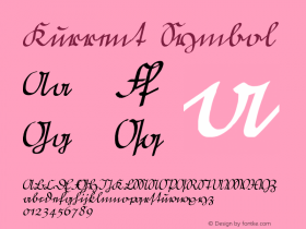
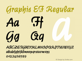
It's not often that Schneidler's funkyGraphik(here probably the digital revival Graphis EF) can be seen in contemporary use. Its peculiar 'w' with the ductus of German Kurrentschrift reveals that the typeface is 80 years old already.

License: CC BY-NC-SA.
"Edith Piaf" is based on Emily Conners' bestseller releaseBombshell(2012), but with smoothened contours and a few customizations. Bombshell's 't' with its bar floating above the stem was obviously considered too quirky. For an ad-hoc modification, the clash of 'i' dot and 't' bar is unsatisfactory.

License: CC BY-NC-SA.
I can only hope this is the first and last time I've seenManhattan Script(2014) in use. This script by the prolific Kimberly Geswein looks like it was made of soggy fries. It has no drive or tension, and the joins are poor — sorry.

License: CC BY-NC-SA.
"Russian Monks" — this poster almost exclusively relies onChaparral(1997). Carol Twombly's humanist slab is also used for some of the other posters as well as for the Franzhans 06 logo.