Starting up FontShop was only the beginning of Erik Spiekermann's ventures in digital type. Soon after the launch of the original vendor of digital type he teamed up with that other famous graphic designer, Neville Brody, and founded FontFont, which has since then become the largest independent foundry of original type designs. Not only does it produce some contemporary classics, but it also houses wildly imaginative designs, and spearheaded many innovations in digital type technology.

The cover for the seminal "Five Dutch Type Designers" brochure, recreated in Adobe Illustrator.
Was setting up a new, independent digital type foundry the next logical step after being involved with the start of the first mail-order type vendor? Or did the idea come (more or less) separately?
The idea came because we suddenly saw all this great stuff being done by young type designers, mainly in the Netherlands. Two of them, Just van Rossum and Erik van Blokland, worked with me at MetaDesign in Berlin. They had Beowolf – the first RandomFont – that took PostScript into previously uncharted territory. And then there were friends like Max Kisman and Martin Majoor. The little publication Five Dutch Type Designers showcasing the first FontFont release included some of these new typefaces from the Netherlands. Neville Brody also had some artwork lying around that could be turned into digital fonts fairly quickly, and I had that old typeface that the German Post Office (Deutsche Bundespost) did not want: PT 55, to be re-issued as FF Meta.
It was the perfect time to set up a new foundry. There were new typefaces that the big foundries (Monotype, Compugraphic, Adobe, Linotype) wouldn't even look at. And apart from Emigre, there were no small, independent foundries. The big guys were too busy digitising their old libraries and were not attuned to the new scene that was emerging . I knew most of these new designers because I travelled a lot – to the Netherlands, Great Britain and the USA – and saw what was happening there. In the summer of 1990 Tobias Frere-Jones walked into my office at MetaDesign in Berlin (which was door-to-door with the FontShop office) because someone had seen his first type design and sent him to me with it. I sent him across to FontShop after 2 minutes, and we published FF Dolores immediately. I do remember that – technically speaking – it was a terrible font, but it hit a nerve.
When we had decided to publish our own fonts, apart from distributing other peoples', the foundry just had to be called FontFont, and Neville drew the logo. At first, FontFont's house colour was dark red. Later we changed it to the FontShop black and yellow colour scheme. If we had thought about "branding" in those days, we might have done things differently. Now the two brands get confused all the time. I don't really care, because FontShop is still the generic name for the whole business.

The FontFont logo designed by Neville Brody; left in the original FontFont corporate colour PMS 187, and right in the current FontShop yellow.
Fudoni actually precedes FontFont, and was added to the library later on. Did it play a role in the starting up of FontFont?
Max Kisman's fonts were early and different. And Dutch. They did have a role because they were wacky display fonts and kind of set the tone for a part of our library, just as Dolores did.
Both Neville and you had released fonts through the traditional foundries — respectively Arcadia/Industria/Insignia and ITC Officina. What was the big difference with your subsequent releases through FontFont?
We were very fast. And we had no committee to tell us what to like.
Editor's note: During his tenure from 1981 to '86 as art director for the influential British "80s fashion bible" The Face Neville Brody hand drew many of the headlines and section headers, introducing an increasing level of experimentation in his originally 1920–30s inspired alphabets. At the summit of his fame Neville Brody took three of his seminal display alphabets Arcadia, Industria, and Insignia to the market, to be released as digital fonts. He originally offered the designs to Letraset/Letrafonts, who turned them all down! Linotype did see their potential, but because of how the foundry operated it took them ages to release the fonts on the market. Brody felt it was already too late by the time they became available, as fashion was changing and they had missed the opportunity to piggyback the wave of success he was riding on. This played a considerable role in his decision to set up an independent foundry together with Erik Spiekermann.
Addition from Joan Spiekermann: However the main reason why Neville Brody wanted to found FontFont was royalties. The fledgling foundry revolutionised the entire structure of royalty payments thus far, and type designers got a hell of a lot more with FontFont than with any other foundry. Originally FontFont practically split the earnings with the designer: 50% to distributors, 25% to the designer, and 25% to FSI/FontFont. Of the REUP (recommended end-user price), which was absolutely unheard of. Brody was offered much less than 10% of the wholesale price by other foundries. The fact that FontFont was the first type foundry – apart from Emigre – that was actually founded by type designers, played a large role in this. It took many years before other independent foundries followed the FontFont model. By then most of those foundries had been founded by type designers, as FontFont was, so it made sense. And that is the main reason why designers wanted to come to us: we were fast, we were cool, and we paid the most. Our slogan summed it up pretty nicely: "Made by designers for designers".
Note: It was easy to be fast at the time, because – as Erik van Blokland pointed out – the large foundries were still too busy digitising their enormous back catalogue. FontFont started with a clean slate, which made a huge difference for the early releases.
Unfortunately the designer royalties could not be sustained. Some years ago, because of increased production costs, FontFont had to drop them to 20% on the REUP – equal to 40% on the wholesale price and still amongst the highest in the industry.
Did you get any particular reaction from any of the big foundries?
I don't know; I didn't ask. I think they didn't take us very seriously at first. Some thought we were beneficial for the entire font market, making it lively and attracting designers as font buyers rather than typesetters only.

Due to the advent of affordable personal computers in general and the Apple Macintosh in particular typesetters were vanishing. In what way are graphic designers a different type of customers/users than typesetters were?
The main difference is that designers buy fonts for projects while typesetters were required to have a large library available at all times. So the typesetters tended to buy the safe established libraries, like Adobe, while designers buy fonts spontaneously. So they'd rather turn to a "cool" library like FontFont's.
Editor's note: Neville Brody once explained to me in the early days of FontFont that his vision of an independent foundry was akin the music industry. Instead of designers being stuck with the perennial evergreens, new designs would be released on a regular basis, and become "hits". Once their shelf life expired due to changing fashion the typefaces would disappear in the background, making way for fresh new type, and so on. Although the longevity of typeface is significantly longer than of songs, the current font market resembles his vision quite a bit.
Did you ever need to "find" fonts to be published under the FontFont banner, and at what point did people start coming to you and submit them?
I seriously cannot remember. Even from the start, new fonts were there, without us actually going out to look for them. I was so involved in the typographic scene (which was very small at the time) that nothing happened without us knowing about it. I had worked for pretty much every foundry during the photo typesetting years (ITC, Berthold, Linotype, Agfa, Scangraphic, Letraset, URW), designing catalogues, specimens, literature and had thus met all the players. Once our reputation as an exciting young foundry was cemented type designers started submitting their work for inclusion in the FontFont library.

Lords and Lady of the FontFonts – the TypeBoard then:
Jürgen Siebert, Neville Brody, Beth Russell, Erik van Blokland, and Erik Spiekermann
How are new typefaces selected to be published by FontFont?
At the beginning it was pretty much me, Neville, Jürgen Siebert, and Erik van Blokland who'd review what we had and decide which type designs would be admitted to the FontFont library. Or sometimes just me, and I would ask Jürgen's opinion because his office was down the hall. I cannot remember when we officially started calling it the TypeBoard.
You have to realise there was no real business plan for a few years, and not much distinction between FontShop and FontFont. Only when I got busier with MetaDesign and had less time for the font business did we start getting more organised about publishing fonts. Don't forget it originally started as a mom and pop shop with Joan and myself in 1988. As soon as we had the first fonts in the warehouse (which was the cellar below MetaDesign's small offices), Joan hired Petra. That must have marked the start of the business proper.
Today the TypeBoard is composed of myself, Erik van Blokland, Jürgen Siebert, with the addition of FontShop San Francisco Type Director Stephen Coles, FontFont Marketing Director Ivo Gabrowitsch, and Punchcut's Jared Benson. We get together twice a year; all typeface submissions are thoroughly reviewed and discussed at those meetings. Depending on the artistic and technical quality, how much work needs to be done to have the fonts sales-ready, but also on what we already have in the library it is decided which ones are included.
Lords and Lady of the FontFonts – the TypeBoard now, December 7, 2009:
Clockwise from front left: Jared Benson, Andreas Frohloff, Ivo Gabrowitsch, Stephen Coles, Ugla Marekowa, Erik Spiekermann, and Jürgen Siebert. Photo by FontFont.
FontFont has evolved from a tiny maverick indie foundry to the world's largest collection of original type designs. What are the most important achievements of the foundry?
We published the first serious alternative text families, like FF Meta and FF Scala, plus the biggest family at the time, FF Thesis. That was a FontFont until we had made it into a bestseller, when Lucas decided to market it himself. We commissioned classics like FF DIN, we expanded the successful faces into larger families, other encodings apart from standard Latin, making them useful for corporate applications.
We attracted a lot of talent by establishing a reputation for giving designers a reasonable share of the proceeds, technical help with production, and a lot of marketing. The FontBook is still the biggest resource for digital type. It is a major undertaking to research, design, produce and distribute and has become an invaluable tool for designers everywhere.
We're very well connected in the world of type. We practically invented font distribution by mail-order and led the field when it went online. And now we've converted most of the library to OpenType, adding more value to the existing library. I also think we've been pretty good in spotting trends and even in creating them. We have discovered type designers in almost thirty countries and we keep getting amazing submissions for the TypeBoard from all over the world.


Stephen Coles.
Made With FontFont was a beautiful testament to the first fifteen years of the foundry. Petra admitted in her interview that it is the book that she continues to leaf through with a feeling of utter joy and accomplishment. How difficult was it to assemble this book?
Very. Jan Middendorp spent months getting designers to participate, gathering illustrations, specimens, editing copy, and giving the book its structure. I designed the format and the grids, and then Susanna Dulkinys and myself did most of the final typesetting and layout work. I was quite shocked to see the state of the files some designers sent in. Wrong resolution, RGB images, no bleeds, superfluous layers, etc. Cleaning up the files took weeks. I'm still amazed at how good all our contributors made the fonts look. It was very rewarding in the end.
What do you think the future might have in store for FontFont? Are there any concrete plans for the next twenty years?
Yes, but not to be talked about here and now. We'll certainly be at the forefront of developments for type on the web, where Erik van Blokland – member of our TypeBoard since the beginning – has been a major player in developing and establishing the new WOFF standard. Web FontFonts will soon be available in both EOT Lite and WOFF – the customer will receive a zip file containing both formats as well as an instruction manual that explains how to use them. More detailed information will be announced when the release nears. This is one of our new challenges – bringing cool new fonts and contemporary classics to the web.
FontCast #6 — Spiekermann on Founding FontShop
At ATypI's Typ09 conference in Mexico City this November, Stephen Coles spoke with Erik about the early history of FontShop. Erik describes the business climate of the time, the genesis of his idea for a type reseller, and the first few months of the business. He also showcases a number of the early FontShop business artifacts and promotional materials, while going through the archives at FSI.
Click here to watch the FontCast or simply push play below.
FontCast is FontShop's video podcast with the most interesting figures in typography and design. It's available on Vimeo and YouTube (this episode available later), and now you can subscribe in iTunes.
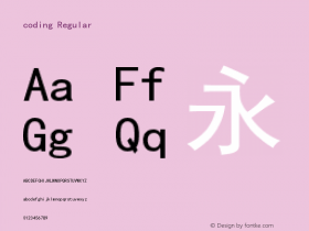
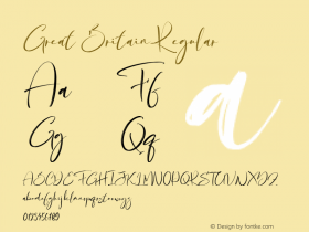
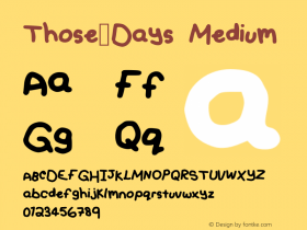
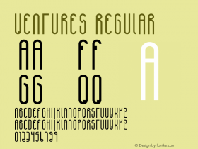
Made with FontFont

Some more eye candy from Made with FontFont by Jan Middendorp and Erik Spiekermann. Photos by FontFont.


Header image:Erik Spiekermann at Typ09, Mexico City, from The Faces of ATypI Flickr Set. Photo by Laurence Penney.