
Farnschläder & Mahlstedt | fmtx, Hamburg. License: All Rights Reserved.
The magazine of the Faculty for Design at Nuremberg Technical University manages its self-selected contextual complexity with the means of the rational typography of the 1960s. It is a matter of positions about and in design.
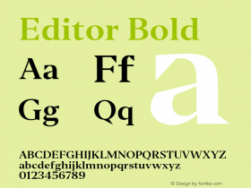
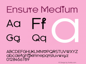
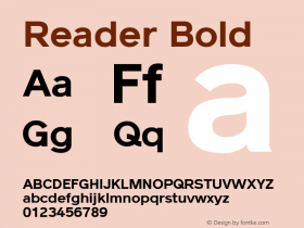
The cover already bears the editorial principle as a relief: the objection "but" in blind embossing technique. Highly succinct is also how the white outer pages interlink with the black edge painting. A contest between black and white, signifying poles of opinion and the concept of juxtaposing contrary views as a productive incentive for reflecting that there is always a "but", an "it might all be quite different." The material thus unfolds across three different tables of contents, depending on the user's needs. The text varieties have been allocated different typefaces, different grades and different column widths. A change of paper ensures further differentiation.
In terms of typography, the magazine acts as a downright specimen book by controlling legibility through indents, sentence widths and column positioning. The reader can thus clamber comfortably through the thicket of arguments. Always remember: it might all be quite different.

Farnschläder & Mahlstedt | fmtx, Hamburg. License: All Rights Reserved.

Farnschläder & Mahlstedt | fmtx, Hamburg. License: All Rights Reserved.

Farnschläder & Mahlstedt | fmtx, Hamburg. License: All Rights Reserved.

Farnschläder & Mahlstedt | fmtx, Hamburg. License: All Rights Reserved.

Farnschläder & Mahlstedt | fmtx, Hamburg. License: All Rights Reserved.

