There are "freebie" fonts lists, and 'freeby' fonts replicator sites coming out the ying-yang. Very few will talk about commercial fonts--but folks, I'm here to tell'ya the commercial fonts are almost always far, far ahead in terms of quality. Some of the free fonts sites have good looking stuff, but your download them and end up with a mess on your hands. Well, not true of these--we can stake our reputation on these fonts--and can guarantee you'll like the way you look when you use them!
Twisting and weaving separate strands makes TwineLearn the art of steel quill, and draw EscrituraYou're gonna love working with Letter Press!Take your publication into the Garden . . . Galeb Texture

Twisting and weaving separate strands makes Twine
 By twisting and weaving separate strands of rope together, a stronger TWINE is created. The distinctive "valleys" that give the twine its twisted and wavy appearance is the result of the twining process.
Similarly, TWINE the font, is an exaggerated representation of the calligrapher's individual pen movements that create a cohesive character which is enhanced by the stencil strokes.
Full story : Robbie de Villiers represented by the Wilton Font Foundry
Click for Another superb sample
... and again you'll love this one!
You're gonna love working with Letter Press!
 Meet the Letterpress! Jakob Erbar's Phosphor was released by the Ludwig & Mayer Foundry before 1923. The origins of Aurora date back to 1912 (Johannes Wagner Foundry).
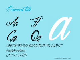
Permanent Headline was designed by Karlgeorg Hoefer, also known simply as Headline. It was fun making a mix out of the three classics with Letterpress Bastard You will quickly get astounding results. To complete the family we added a font containing random symbols we also found in the metal type boxes. Please note that we provided loads of ligatures for double-letters to make your design look as authentic as possible.
Full story : Marcus Sterz represented by the FaceType Foundry
Now Have some real fun
Learn the art of steel quill, and draw Escritura
 Escritura is a steel quill font, some call it handwriting, some call it calligraphy, but it's really a chisel-point quill font. There are 20 styles included by font designer Ricardo Santos, represented by the Vanarchiv Foundry
This handwriting typeface was created for editorial purposes and the letter forms are influenced by chancery handwriting from the Italian Renaissance. The asymmetrical shapes of the undulating serifs cause the characters to have a large aperture. Originally designed for display sizes, the typeface also comes in a text variant for small sizes. With taller vertical proportions, the text version has slightly longer serifs and increased white space between the characters to optimize legibility in small sizes.
Full story : Ricardo Santos, represented by the Vanarchiv Foundry
Isn't this elegant lettering!
Here's the character set for the main font!
Take your publication into the Garden . . .
 Garden is a serif display handmade font with a playful and spontaneous feel. The Garden family offers a font with a set of original "catchwords" ('Garden Catchwords', based on brush calligraphy), floral dingbats and botanical ornaments. The family has 20 different postures from simple to ornate, including the dingbats font "catchwords"
The OpenType version provides a wide range of creative options. Garden is well-suited for text composition, posters, headlines, label design and handmade-style items. Garden is inspiration, nature and joy!
Full story : Coto Mendoza , Luciano Vergara represented by the Los Andes Type Foundry
Here is a really fun sample--reversed out type
This one is a little more civilized layout
Galeb Texture
 This 'vintage' style font comes from Slobodan Jelesijevic at the Tour de Force Font Foundry Foundry and man-oh-man is it versitile! In this collection you get : Galeb Texture One.otf, Galeb Texture Shadow.otf, Galeb Texture Two.otf

Full story : Slobodan Jelesijevic, represented by the Tour de Force Font Foundry
All of these fonts are tested and proven to be rock-solid fonts, well worth the price. They're on special right now, but we cannot guarantee how long the special will be available.
