Like music, typefaces show the influence of a time in history, genera or current vogue. Again like music, some are fleeting, such as grunge fonts and disco music; while others, like rap and geometric sans, have become permanent parts of the artistic spectrum.
For the next couple of days, Fonts.com will be offering discounts on fonts from three of these genres in its Type Through the Eras program. Highlighted are a number of designs influenced by wood type, experimental typography and sign painting.
Wood Type
In the early part of the 19th century an American found a way to mass-produce fonts of wood type. (Previously, all wood type fonts were cut hand.) Because this coincided with the birth of the industrial revolution – and advertising – wood type founders became the precursors of modern digital type foundries. These early letter design companies busily put to work producing great quantities of decorative and unusual typefaces for the design community. Wood continued to be used to produce large decorative fonts, through the 19th, and well into the 20th century – when it was replaced by photo, and then digital technology.
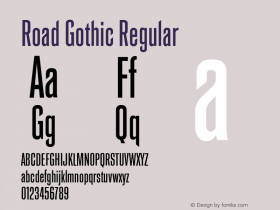
Today, the first mass produced wooden letters are collector's items, marking the end of one era of creating fonts – and the beginning of another. Digital interpretations of wood type fonts like the King Wood™ and Railroad Gothic™ typefaces capture the warmth, personality and, at times, the quirkiness of their 19th century forbearers and will clearly brand projects with the touch of a time and place.

Experimental
Those who make fonts have always experimented with the design of typefaces. Gutenberg was experimenting with ways to replicated the work of scribes, Baskerville experimented with designs that could only be printed on the finest paper and in 1816, William Caslon IV, the great, great grandson of the William Caslon that gave us the English serifed design, was experimenting with fonts and came up with the first sans serif typeface. More recently, experiments by Max Bill and Paul Renner in the early part of the 20th century pushed the typeface design envelope even further.
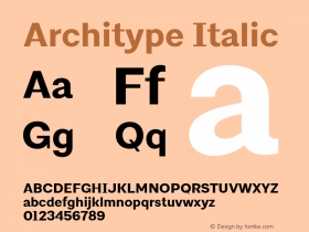
Digital renditions of these designs – and new experiments – include the Architype Bayer-type™, Buxom™ and Shatter™ typefaces.

Sign Painting
Some 21st century observers had predicted that sign painting would go the way of 8-track tapes and cargo pants – that software, adhesive vinyl sheets and digital plotters would be the death knell to painting signs by hand. Indeed, up until recently, the future of hand painted signs looked bleak. The old – and possibly final – generation of sign painters was retiring, or passing on. Vinyl sign shops were cropping up like dandelions in suburban lawns.
Within the last few years, however, this downward spiral has reversed direction. Vinyl sign shops continue to thrive, but a vibrant new community of sign painters is sprouting. They are young. They help each other learn the craft – and their work is driving a demand for hand painted signs.
But not everyone can afford hand painted lettering and not every project calls for letters drawn with a brush or pen. This is where "sign painting" and "hand lettering" fonts come in. They replicate the craft, but at a much more affordable price. Some, that take advantage of the OpenType® font format, can produce surprisingly convincing results. The Spills™ typeface is a sendup to sign painting of the last century and the Workhorse™ design can capture the feeling of letters painted on a rough surface. There are more. Have a look.

