I was sent a press release yesterday about how a senior citizen was defrauded by sweepstakes scams. It's a sad story about an 88-year-old woman who was bilked out of her life savings by truly bad people. Fortunately, it appears that she will be getting back at least some of her money.
The reason the press release was sent to me was because one of the culprits in the fraud was a typeface. And no, it wasn't Comic Sans™.
Actually, it wasn't a specific typeface, but a style of type. Italics were sited as part of the blame for misleading the octogenarian. According the release, "The words 'no donation necessary' were written at the bottom of the page in italics, which italicized fonts are 18% harder to read for seniors rather than regular fonts." The poor woman could not read the copy that told her she did not have to send money to get money.
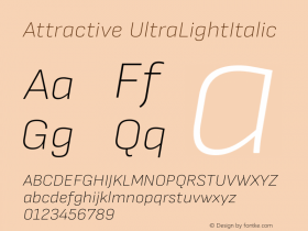
Truth be known, italic type is harder for everyone to read. A little while ago, I wrote about italic typefaces in my "Italics: Typography's Aristocrats" post. In it, I extolled on the beauty of these designs – but I did not share any of their shortcomings.
So, to set the record straight, Italic typeface may be beautiful – but they can also be problematic. The first problem is that italic fonts, especially the cursive variety, are too pretty for most graphic communication – and too weak to be assertive. Readers may say that they think italics are attractive, but when it comes to reading them, studies have proved that italic fonts slow down the reading process by as much as 14 to 20 words per minute. Readers have to work harder to read text copy set in italics, which not only impedes the reading process, it also retards copy comprehension.
Italic types are also normally lighter in weight, and more condensed than their roman counterparts. This delicate quality may add to their beauty but it detracts from an italic design's ability to be a graphic emphasizers. Truth is, italics don't emphasize very well at all. Bold typefaces highlight. Italics, well, they just look pretty.

Allan Haley is Director of Words & Letters at Monotype Imaging. Here he is responsible for strategic planning and creative implementation of just about everything related to typeface designs.
