- Relevant font family
Linotype kicks off the new year with the launch of five new font families in OpenType format. The new additions to the Linotype Library – Sunetta, Aptifer, Linotype Aroma OT, Anno and OCR A Tribute – cover a wide spectrum of styles, from handwritten elegance to retro computer print." />
Linotype kicks off the new year with the launch of five new font families in OpenType format. The new additions to the Linotype Library – Sunetta, Aptifer, Linotype Aroma OT, Anno and OCR A Tribute – cover a wide spectrum of styles, from handwritten elegance to retro computer print.
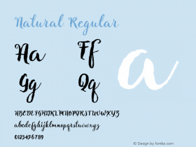
The new typeface Sunetta is a handwritten inspired typeface with three weights, Flair, Charme, and Magic that sum up the whimsical nature of its curling, beckoning brushstrokes.
The designer Prof Werner Schneider studied under the master calligrapher Friedrich Poppl to refine his command of the brushstroke. Inspired by the gentle delicacy of calligraphy, Schneider tested his letter designs for years, developing them until he had nearly 1,000 samples. The digitized fine strokes chosen for the three weights make them work like ligatures, encouraging creative combinations for a handwritten, random feel – ideal for impressive display texts, friendly announcements or stunning invitations.
Two new families, Aptifer Sans and Aptifer Slab hark back to straight, slightly condensed old American Gothic typefaces for their creative power. The Swedish designer Marten Thavenius combined this simplicity with modern demands for legibility and openness. Aptifer Sans relies on subtle details for easy reading. Aptifer Slab makes its impression using wedge slab serifs. Both are suitable as a display or text font, for example in magazines and newspapers or corporate graphics and signage. Thanks to its simplicity and modernity, Aptifer offers highly legible and recognizable letters for readers across all cultures.
OCR A Tribute refines the old credit card and computer look of OCR A, the first machine-readable alphabet originally designed in 1968. The designer Miriam Röttgers breaks with the old style, elaborating on it for a more modern, typographic spin. She also extended OCR A Tribute to include a complete character set, expert characters, as well as both lining and old style figures. Fans of the original will love its new adaptability and sleeker lines.
Linotype Aroma OT is the updated release of the Linotype Aroma family, a natural and independent typeface originally created by designer Tim Ahrens in 1999. Now it is available for first time in OpenType format with compatibilty for 48 languages, including eastern European alphabets. Linotype Aroma OT also adds two additional weights, Bold and Extra Bold, boosting this family's all-round refreshing style and functionality.
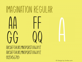
Designer André Maaßen typically finds inspiration for his designs in the beguiling simplicity of everyday objects. For is new typeface Anno, a New Year's card for the year 2000 sparked his imagination. Anno, made up of four weights, is a semi-classicist typeface with a high degree of stroke contrast, aiming for the perfect printed image.
 Linotype |