Having difficulty getting your message across? Try Comic Sans (or any other unusual typeface).
Perhaps because people learn better when it's a struggle to do so, content written in difficult-to-read fonts is more readily remembered than content rendered in fonts that are easy to comprehend, a group of researchers has found.
Their seemingly counter-intuitive findings could interest artists and designers wishing to maximise the impact of their type and layouts.
In both lab experiments and in classroom trials, the researchers found that people learn new written information more easily if that information is presented in a font that is comparatively difficult to read, rather than with a font that is easier on the eyes.
Their results fall in line with other educational research that shows that the more challenging it is for people to learn new material, the more thoroughly they will ultimately understand that material.
"More cognitive engagement leads to deeper processing, which facilitates encoding and subsequently better retrieval," the researchers summarized in their paper Fortune favors the Bold and the Italicized: Effects of disfluency on educational outcomes, which was published in the January issue of the Cognition scientific journal.
A Princeton University student, Connor Diemand-Yauman, conducted the research, with the help of adviser Daniel Oppenheimer and Indiana University doctoral student Erikka Vaughan.
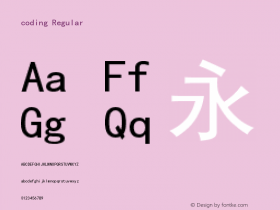
In a series of lab tests, volunteers were asked to memorise a set of physical characteristics attributed to hard-to-remember fictional names of an alien species. Some of the lists were rendered in either Comic Sans MS or Bodini MT, fonts considered difficult to read. The other lists were rendered in the more standard Arial font.

Those who read the characteristics in the fonts that were difficult to read, or "disfluent" as the researchers called them, scored 14 per cent better on the memory test than those who read the Arial font.
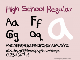
The researchers also found this improved performance holds in the classroom as well. Classroom presentations and worksheets for 222 Ohio high school students were rendered in three highly disfluent fonts--Haettenschweiler, Monotype Corsiva and Comic Sans Italicised. The students with these materials learned the material more thoroughly than their peers who used the original material, the researchers reported.
By only using fonts available free with Microsoft Word, it's impossible to tell if the researchers would have received the same results from more graceful quirky fonts--but the researchers' conclusions that it's the length of time needed to read words that is related to their comprehension means that you can use Eames Century Modern or LiebeErika just as effectively.