Late last year I received a review copy of Dark Age: Dominion, the first instalment of a trilogy of graphic novels. This new independent graphic novel is the first venture into the world of sequential art by identical twin brothers Mada and Vin Shaye. You may know them as the alter egos of Adam and Nick Hayes, of the Identikal type foundry. Originally from London, Identikal has been based in New York City since 2003, where the brothers output original and futuristic typefaces. Three type families featured in the graphic novel – Bennu Sans, Enforce, and Dreamer – have now been released on FontShop.

Adam and Nick Hayes's Dark Age Trilogy is a violent and gritty epic set in a dystopian future. It gives a shocking and compelling glimpse into the dark, lawless side of human nature and the depraved pleasures of a modern society pushed beyond the brink of sanity. The world as we know it is dead. The ashes of civilisation now blow across a planet in freefall, where death rules and what's left of humanity – merciless gangs and ignorant scavengers – clash over its scraps. Technology and information are tightly controlled by the Corp who rule the Slums.

Inside page 37 from Dark Age: Dominion.
Though it can be read as a stand-alone graphic novel, Dark Age: Dominion is the first volume in what will be an engrossing trilogy packed with danger and intrigue. Nick and Adam Hayes, writing as Mada and Vin Shaye, have brought their experience from the advertising, photography, and graphic design industries into the writing, illustration, and art direction of Dark Age. In the eight years spent developing their concept, they drew inspiration from their childhood reading including Tintin, Asterix, and comic book writers such as Alan Moore, Frank Miller, and Moebius to create this original work of graphic storytelling.

Inside page 51 from Dark Age: Dominion.
With its striking illustrations and unique approach, the Dark Age Trilogy looks to break new boundaries, and aims to be the next success story in the world of graphic novels. The book uses an inventive system of time stamps, global co-ordinates, credits, and captions that identify time, location, and protagonists for every scene, and help the reader navigate through the book. Explanatory pages with maps, a key to the symbols, and a glossary book-end the story.

Inside page 156 from Dark Age: Dominion.
The production values of the graphic novel are astounding. The cover is printed on 12pt C1S, the industry standard for white "smooth finish" cover stock, in three special colours – Metallic, luminous, and Special Black. Furthermore it features matte lamination, gloss spot UV, emboss stamping, and foil press. It took nearly two weeks to print, as it was sent through the press with each individual process as well as each individual ink. Interior pages are printed on coated satin 60# text (most graphic novels use a gloss, which is cheaper). The main body of interior is printed in CMYK, with two 5 colour interior sections (CMYK + Metallic). Dark Age: Dominion contains over 760 full colour illustrations, six original typefaces, and 164 pages.

Inside page 159 from Dark Age: Dominion.
Dark Age immediately pulled me into a rich universe populated with intense and intriguing characters. The story is fast paced, highly readable and the presentation is world class. The seamless blend of quality comic book layout and cutting edge graphic design has raised the bar and added a dimension rarely seen in the format. Thoroughly recommended.
Jason Green | Cultural Ambassador, Black Rock Studio/Disney interactive
When I first came onboard Dark Age I was excited and slightly anxious. The brothers laid out their vision for the project and it was extremely ambitious. It was the kinetic throttle of the Mad Max films fused with the dense mythology of The Lord of the Rings and yet it had to stand on its own. I am happy to report the finished first volume met that challenge and added another dimension. At the core of the story is a deep empathy for the underclass and those who struggle. This is just the beginning – hang on for the ride!
John Figueroa | Writer: The Project (Paradox Press/DC comics) and Marvel Knights (Marvel)
Dark Age Trilogy creators Mada (left) and Vin (right) Shaye at the Dark Age: Dominion Launch Party, October 8, 2010.
Dark Age: Dominion, book one of the trilogy, launched on October 8, 2010, at New York Comic Con. The Shaye brothers made a significant impression in the world of comics, as the book proved to be a hit with US comic book fans and took NYCC by storm. The pair mixed with their army of fans who had rushed to purchase the book upon its eagerly anticipated release, signing copies and posing for pictures. Over the course of the three-day event at New York's Javits Centre, all 1000 copies of Dark Age: Dominion made available sold out, much to the joy of Mada and Vin.
We're totally independent and produced this ourselves, from every illustration to the design of the fonts and publishing. This has given us total artistic control.
The likes of Marvel and DC produce some amazing comics, but this isn't your average graphic novel, and I think the reaction from our fans this weekend has shown that. There's plenty more to come and we're excited with the reaction so far.
The Biohazard Reader at the Dark Age booth, named best NYC Comic Con prop by publishers blog Galleycat.
At their booth, Mada and Vin Shaye also participated in many interviews for individual magazines, including a preview in Wired Magazine. Publishers blog Galleycat named the Biohazard Reader at the Dark Age booth the best NYC Comic Con prop. The internationally respected design magazine IdN made Dark Age their POTM (Pick Of The Month) for December, and it received an overall five star review at Grovel – Graphic novel reviews.
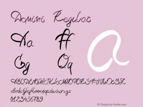
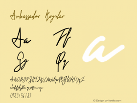
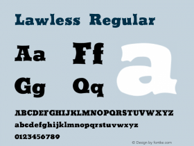
The typefaces from Dark Age: Dominion
Three type families/faces used in Dark Age: Dominion are available for licensing from Identikal through FontShop.
Bennu Sans is the main typeface used throughout the graphic novel. Although it is a proportional design, the wide capital I and J with serifs, and the narrow M and W lend it a monospaced appearance, without the awkward letter spacing that usually comes with this. The forceful tech sans comes in two variants – Bennu Sans A has rounded stroke edges, giving it a whiff of OCR-A or FF Magda Clean, while Bennu Sans B has "normal" angled corners. Both variants are available in four weights with matching italics, which brings the total number of styles to 16 for this family.
The strict geometric design Enforce is reminiscent of Russian constructivism. There aren't any curves in the angular character shapes, only straight lines. It is a single weight display family in two variants – the regular style Enforce A and the stencil version Enforce B – each with matching italics.
Dreamer is a geometric sans composed entirely out of dots. As its name implies, it is the principal typeface for the dream sequences set throughout the Dark Age graphic novel trilogy.
If you wish to order Dark Age: Dominion, comics distributor Diamond has assigned the graphic novel order number FEB111062 (DARK AGE DOMINION GN VOL 01 (OF 3)). Retailers should use this number to order the graphic novel, or comic buyers can give it to their retailer.
Special promotion for FontFeed readers
Identikal offers $5 off the book (indeed, a quarter of the price off) if a customer buys any Identikal font through FontShop. Proof of purchase is needed. This offer is only available through books ordered from the Dark Age website.