The winner of Rocking FontFont's Free Fonts contest was announced yesterday. Popular vote determined the winning entry was the cover for Violator, Depeche Mode's best selling album ever that propelled the band into international stardom, re-imagined by Mladen Balog. Mladen used more than 70,000 FF Yokkmokk glyphs to recreate superstar rock photographer Anton Corbijn's iconic red rose on black background. He wins $500 in credit toward FontFonts.
While the contest was all about designing alternate covers for real or imaginary records, here we look at the "real" sleeves of the music albums released last month.

Alela Diane & Wild Divine is American singer/songwriter Alela Diane's fourth album, with her husband and father providing support as part of her backing band. The snapshot-style photograph on the album cover almost looks like a happy accident, as if we are witnessing an off-guard moment. This uncannily draws the viewer into the scene, creating a surprisingly intimate atmosphere.
The typography is classy yet rather conventional. If I am to be completely honest it looks a little dated. Letterspacing all-caps Bodoni, set justified, overlaid on the swashy ampersand of Caslon 540 Italic is a very late-eighties/early nineties post-modern thing to do.

The album sleeve of How to Become Clairvoyant – Robbie Robertson's first album since the 90s, which finds former The Band guitarist looking back on his five-decade long career – features an enchanting image. Undefined over-exposed spots and streaks of light lend the artwork a mysterious, mystical atmosphere.
Unfortunately what could have been a beautiful cover is marred by poor typography. Not only is VAG Rounded a very "standard" rounded sans, I even think it was squooshed™. And if you want the hand written script to look natural you'd better not pick such a clumsy and stilted design. Just imagine what this could have looked like with the energetic La Figura for example.

Equally mysterious is the artwork for Raven in the Grave, the fifth studio album by The Raveonettes, showcasing much of their original sound. The sketched illustration shows a raven – is it taking off, or on the contrary trashing about with its last forces, wounded and dying? – reproduced as a negative. This nicely connects the album title to the Danish duo's dark, droning, distorted guitar pop.
The eroded serif caps with swash initials match the mood of the artwork, and the impression I get that those initials were hand drawn benefits the darkly Victorian atmosphere. However I am not too happy with the shape of the initial "R" – its leg and upper left swash are too awkward, its weight too light.

Capo, Jim Jones' fifth studio album which reunites the rapper with his Dipset cohorts Cam'Ron and Juelz Santana, and guests Raekwon and Snoop Dogg amongst others, is nothing short of a typographic train wreck. I understand the desire to have a custom drawn logo for your artist name, yet this ham-fisted adaptation of Trajan is unbalanced and inconsistent – what's with the weight distribution on that dreadful "E"? The fake metal finish and three-dimensional effect can't hide this was done by someone who clearly doesn't know how to draw letters. And please grow up and lay off that juvenile adoration of gangsters, really. They're not glamorous; they're parasites.

The album cover for Tron: Legacy Reconfigured – Daft Punk's original Tron: Legacy movie soundtrack remixed by a bunch of A-list producers including Moby, The Crystal Method, and Kaskade – unabashedly taps into the bitmap aesthetic of eighties arcade games from the original movie. From the TRON logo rendered on a rough grid to the pixel sans serif with numbers substituted for letters and the electric green on black, it all looks like the start-up screen of an early computer game.

One's highest aspirations in life should be to make someone's day a little more surreal, a little more surprising. This is what makes the photograph on American Nomad, the second album by Nashville roots-rock, indie-folk band The Apache Relay, so endearing. The image of the four band members balancing on a tandem bike betrays an innocent yet very earnest irreverence, bringing a smile to the face of the viewer.
The weathered serif face is OldStyle, a vintage design by HPLHS Prop Fonts. Once again this example clearly shows the problem with most free fonts. While the design is acceptable in its genre, the font is very poorly spaced. See for example the gap between "AP" in "APACHE", and how the "P" crashes into the second "A". If you are going to use a free font don't just set it out of the box, but always check the spacing. Because properly spacing and kerning a font is a incredibly time-consuming specialist job this is one of the aspects free font creators often skimp on.

What I don't understand is how established names in music also fall back on poor quality free fonts. The license fee for a proper typeface is a tiny blip in the total budget for an album release. Using a free font make the artist seem a little cheap when the specific design of said free font doesn't add anything unique to the mix. This is for example the case with So Beautiful or So What, the 12th studio album (his first in five years) by veteran singer-songwriter Paul Simon. The image itself is mesmerising, an abstract display of colourful light on a simple black background.
While the Helvetica-inspired free font Walkway may look decent from a distance, examining it from up close reveals its many shortcomings, from the design flaws in select characters to the problematic weight distribution and the mechanically distorted styles. It is a shame that so little attention is paid to typography in this high-profile release.

I am doing my utmost best to refrain from shouting and cursing here. This is complete and utter rubbish; the artwork for Share the Joy, an album of '50s girl-group-style garage rock by Brooklyn trio Vivian Girls simply is very very poor. Fair enough they wanted to use a children's drawing, but it displays none of the vibrancy nor the energy I am accustomed to seeing in those. And don't get me started about those noodley hand rendered script caps. The whole album cover is pale beyond belief, literally and figuratively.

Helioscope, the second album by Vessels, the post-rock band from Leeds, England, on the other hand proves that very beautiful things can be done with drawings on album sleeves. The obsessively detailed illustration in desaturated greens and reds reminds me a little of Chris Ware's work. The hand drawn band name, an intriguing design which sits somewhere between a sans, a semi-serif and an upright script, beautifully matches the style and atmosphere.

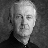
Another illustrated cover that works a lot better is I'll Never Get Out of This World Alive, an album of country rock produced by T-Bone Burnett for the politically active singer-songwriter Steve Earle. The artwork was drawn by Chicago artist Tony Fitzpatrick, who has done cover art for numerous albums, such as the Neville Brothers' Yellow Moon album (nominated for Diamond Award, Best Album Cover), Lou Reed's Big Cat, and all of Steve Earle's solo albums since 1996's I Feel Alright, as well as the cover for Earle's book of short stories, Doghouse Roses. Rife with symbolism and brightly coloured, it brings to mind ethnic American and Latin American art, which makes the choice of the wide wood-type slab serif Hellenic Wide conceptually and visually sound.

Anyone familiar with Duluth dream pop band Low will agree the cover for C'mon – an album of swirling organ, hymn-filled group harmonies, and choral percussion recorded in a converted Catholic church – not only is gorgeous but also perfectly embodies what they are and sound like. Although it may seem a little haphazard the composition of the photograph is spot-on. The pale yellow burst of light revealing subtle shades of red and blue behind Mimi Parker's silhouette can be interpreted in various ways – partly sacred like the heavenly light shining down on those who believe, partly profane like the light show in a disco or at a concert, and partly science fiction as in "Take her away, Mr. Sulu – warp factor 5".
The beautiful rough brush script lettering is impeccably positioned next to the heart of the burst. Its gritty outline provides the perfect contrast to the smooth, slightly blurry streaks of light.

Sometimes a specific combination of elements in a design can conjure up unexpected connotations. Anyone can see the cover artwork for Sing It Loud, the third Nonesuch effort by iconoclastic country singer k.d. lang, is a contemporary design. Yet the black-and-white picture with the broad brush strokes of Mrs Sheppards from the Bluemlein Collection in yellow, orange and dark red immediately made me think of vintage rock 'n' roll imagery from the fifties.

The connotations in album cover for Paper Airplane, in which Alison Krauss brings a bluegrass feel to rock with the help of Union Station, are anything but unexpected. The art direction of the shot and the treatment in sepia tones squarely refer to the early 1900s. Distressing the type set in Adobe Caslon was a wasted effort, as this image is far too slick to be taken seriously as a vintage design. This kind of commercial fakery is a bit of a let-down.

No Help Coming, the third release of retro country rock and rockabilly music which sees British singer-songwriter Holly Golightly pair up with Lawyer Dave, looks far more authentic. The slightly out-of-focus, slightly offbeat photograph in sepia tones convincingly refers to images from that same period in time.
Windsor, the 1903 design from Stephenson Blake is historically correct and frankly doesn't require any weathering to look the part. Nice touch – treating the album title as a telegram with Cablegram Regular on a strip of paper lends it a sense of urgency.

Somewhat in the same vein is Here Before, the first collection of new music in nearly 19 years by post-punk/new wave band from New Jersey The Feelies. Here the image is given a retro look by colouring in the black-and-white photograph and adding an analog photo border. Substituting small caps for caps in Bembo is a practice of the nineties, but it kind of works in this context.

It's amazing how feature-rich OpenType scripts can create convincing digital calligraphy. On The Family Sign, the new album released through Rhymesayers by Minnesotan hip-hop group Atmosphere, swashy alternate characters and curly ornaments of Bickham Script Pro interlock like tendrils to form an intricate latticework. Personally I am no fan of gradients in letters, but here it works wonderfully well in combination with the simple black and white photography. Not exactly the cover I'd expect for a hip hop album; for an underground outfit this actually is a good thing.

Wasting Light, the seventh studio album from the alternative rock band Foo Fighters, produced by Butch Vig of Nirvana's Nevermind fame, sports terrific artwork. The colourful cluster of the band member's faces with all-caps Galette at the top is the work of creative studio Morning Breath. They explain on their blog:
This package was done with the old tools of the trade like copy machines and exacto blades! It has also been printed with no cmyk printing! All spot colors with transparent inks to get that extra flavor.

The fifth album by Elbow, Build a Rocket Boys! further showcases the poetic, lyric-driven, atmospheric music of the Manchester five-piece alt-rock band. Just like their previous outing the Mercury Prize-winning The Seldom Seen Kid, the cover features a painting by Oliver East. East also created illustrations for each song on the album. He animated each illustration over a fragment of its corresponding song, and produced a full length video for Open Arms. The band name and album title are set in two different digitisations of Caslon – respectively Matthew Carter's Big Caslon and Adobe Caslon.
Elbow – Build a Rocket Boys! | The Birds
Elbow – Build a Rocket Boys! | Lippy Kids
Elbow – Build a Rocket Boys! | With Love
Elbow – Build a Rocket Boys! | Neat Little Rows
Elbow – Build a Rocket Boys! | Jesus is a Rochdale Girl
Elbow – Build a Rocket Boys! | The Night Will Always Win
Elbow – Build a Rocket Boys! | High Ideals
Elbow – Build a Rocket Boys! | The River
Elbow – Build a Rocket Boys! | Open Arms
Elbow – Build a Rocket Boys! | The Birds (reprise)
Elbow – Build a Rocket Boys! | Dear Friends
Nick Southall a.k.a. Sick Mouthy discusses the album artwork in detail on his blog.

The album cover for Last, the album produced by Adrian McNally for the Northumberland folk group The Unthanks, features– spoiler alert! –one of my eight faces for the third issue of 8 Faces magazine. Odile by Sibylle Hagmann is loosely inspired by W.A. Dwiggins' 1937 experimental typeface Charter. Although the style of the type matches the atmosphere of the vintage illustration, the overall design is underwhelming.

Now this is fun. Condors, the debut album of Nedry (named after the character portrayed by Wayne Knight in Jurassic Park), does a bitmap reconfiguration of an analog picture. The condor in the album title is rendered on a rough pixel grid, but instead of filling the areas with flat colour photographic textures of the corresponding areas are used – feathers, skin, etc. This aptly translates the "bordering on obsessive ideas of how electronic and analogue instrumentation could collide, fuse and synergise within a live setting" of the British trio into an image. I think it must be one of the most successful visualisations of sample-based electronic music I have seen.

We find another bird of prey on the sleeve of the self-titled album by Dennis Coffey who sounds more vicious than ever on this masterpiece of tough, psychedelic soul. Of course not an actual representation, but mirroring the multiple exposures of the 70-year old guitar legend wielding his axe suggests the silhouette of a majestic eagle taking flight. I also imagine a hint of Arcade Fire's Neon Bible. Normally I don't care much for this seventies display face, but in this design the Italia capitals nicely enhance the glorious image.

The cover forThe Hollow, the full-length album of emotionally-driven metalcore the Dallas, Texas metal/screamo group Memphis May Fire is as devastatingly beautiful as it is quietly gruesome. This is dark romanticism at its best. The intensity of the desaturated image – a mixture of textured vintage portrait photography and anatomical illustration straight out of a collection of curiosities – grabs the viewer by the throat, as if one was confronted with one's own mortality.
Beautifully complementing the image, the custom designed band logo is a brilliant example of updated Victorian lettering. It brings to mind some of the work of Margo Chase and Jonathan Barnbrook.

In a world of rampant plastic surgery and Photoshop gone wild, grand dame of country and folk Emmylou Harris masters the art of ageing gracefully to perfection. On the cover of Hard Bargain, the legendary country singer's 21st studio album featuring many of her original songs, the dreamy photograph depicts her as an almost ghost-like apparition sliding by, seemingly weightlessly. To fit the elegant image a delicate Didone was used for the singer's name, while the album title is set in a heavy weight of Interstate.

The sleeve for the album of dubstep and techno jams Black Sun, the collaboration of London-based electric artist Steve "Kode9" Goodman with Stephen "The Spaceape" Gordon, proves that there is no need for faux Asian faces to generate an Asian atmosphere. Having the capitals of Monotype Grotesque Extra Condensed cascade vertically effectively suggests Chinese calligraphy, even though conventional Latin character shapes are used. This is one possible scenario to avoid the trap of cultural stereotyping.
I've always had a soft spot for Monotype Grotesque. Contrary to the systematic ranges of weights in contemporary type systems, this family only has a select number of styles. Some of them even have such a strong personality that it somewhat sets them apart from the rest of the family. On one hand this limits the possibilities of the typographer. Yet on the other hand this can have a liberating effect, as narrowing your options helps you focus.

Experimental type can be tricky. When the concept takes precedence and is shoe-horned into the character shapes this often leads to disastrous results. This is narrowly evaded on Wit's End by Cass McCombs, who was once dubbed "unobtrusively brilliant" by legendary radio deejay John Peel. The interplay of circle arcs and radius produces some intriguing shapes, forming a peculiar pattern over the portrait of the singer-songwriter.

We conclude this episode with a retro cover for the self-titled debut album of dancefloor, disco jams by Holy Ghost! The repeated cut-out photographs of the two friends Alex Frankel and Nick Millhiser who make up the New York-based electro pop group remind me of the post-punk covers of the eighties. This impression is strengthened by the compact sans serif over a triangle.
As this instalment started sliding in the publishing schedule due to the delay caused by the Amazon EC2 cloud crash, it will be followed really soon by the upcoming ScreenFonts. This means you won't have to wait too long for your next fix of pop culture. ; )