In addition to creating the Electra® typeface family – and many other important typeface designs in the early part of the last century – William Dwiggins also fashioned a couple of alter egos. He employed them to comment on his work and the state of the typographic arts. The most well known was Dr. Hermann Püterschein, a transplanted German of irrefutable typographic knowledge and taste. Another was Kobodaishi, a patron saint of the lettering arts and great Buddhist missionary in ancient Japan. It was Kobodaishi that Dwiggins turned to for guidance in the drawing of Electra.
"I told him," wrote Dwiggins, "what I was doing and said that it would help if he could give me a kind of an idea what the type style was going to be in the next 10 years – what was going to be the fashionable thing, etc." Among other bits of advice, Kobodaishi told Dwiggins, "take your curves and streamline 'em. Make a line of letters so full of energy that it can't wait to get to the end of the measure."
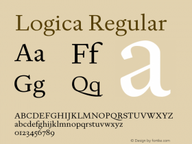
Dwiggins clearly followed Kobodaishi's counsel. Electra is a design that radiates energy. Although Electra falls within the "modern" or "neoclassical" family of type styles, it is not based on any traditional model, nor is it an attempt to revive or reconstruct any historic typeface.
 Jim Parkinson's newest typeface, Parkinson Electra, an interpretation of Electra just announced on Fonts.com, has more than a similar appearance to the earlier version. In the design process, Parkinson felt as if he was getting advice on how to interpret the original's shapes and proportions. It wasn't the mythological Kobodaishi, however. It was Dwiggins, himself.
"As I was working on (the design) something unusual happened," recalls Parkinson. "I was no longer just interpreting a typeface. I felt like I was beginning to understand Dwiggins' thought process. It was almost as if I knew the man."
Parkinson Electra is not a remake of Dwiggins' design. The newer typeface is slightly heavier than the original, and its serifs are more delicate. Parkinson's design also has a softer quality and spaces somewhat tighter. Parkinson Electra does, however, exude the energetic aura of the original.
The Parkinson Electra family is available as desktop fonts from the Fonts.com, Linotype.com and ITCFonts.com websites. It is also available as Web fonts from WebFonts.Fonts.com.
Click here to learn more about Parkinson Electra.

Allan Haley is Director of Words & Letters at Monotype Imaging. Here he is responsible for strategic planning and creative implementation of just about everything related to typeface designs.