Well, if you can say one thing about previous ISTD Awards two years ago, again three FontFonts collected Certificates of Excellence at the FF Dagny, originally developed by Örjan Nordling and Göran Söderström as DN Grotesk for Swedish newspaper Dagens Nyheter (DN); FF Milo Serif, the companion face for FF Milo, Mike Abbink's compact typeface suitable for magazine and newspaper typography; and Max Phillips' elegant workhorse FF Spinoza, a classic text family with just enough individual character to hold its own in display sizes.
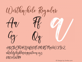
Eduardo Berliner's calligraphic serif face Pollen, published by TypeTogether, received a Premier Award, which is awarded to an outstanding submission in each category.
Pollen finds a perfect balance between technical excellence, careful design of letter forms for extended reading, and a measured dose of charm and personality. Its informal feel allows for successfully typesetting a wide range of applications, from magazines and fiction books to advertising and websites.
Calligraphy, be it done with the broad-edge pen, brush, or other tools, has been fundamental in the development of Pollen. Its influence is clearly visible in the construction of the top serifs contrasting the curved bottom serifs and the fluid aspect of terminals and tails, such as on "g" and "r". The shapes of the diagonal letters are based on a less formal calligraphic model, but still uses the broad edge pen. The letters were then subject to a further process of pencil drawing and digital re-interpretation, which gave them the final shape. The designs of "e" and "c" are derived from drawings made with only one continuous line, with the pencil always touching the paper. The letters "g" and "y" express the intention to bring informal elements to a typeface intended for long text reading, usually characteristic of casual writing.


To design a typeface which takes a calligraphic approach and still feels contemporary is a tall undertaking in my opinion. But Pollen successfully manages to achieve exactly this. The letterforms are beautifully and carefully crafted, yet infused with charm and personality. A perfect balance of technical excellence and the poetry of form.
Tom Hingston, jury member
Interviewing the FontFont designers

Because I enjoyed doing the mini-interviews two years ago, I thought I'd simply repeat them this year. Although it's an unfair question, I am always curious how the designers feel about receiving recognition for their work in a type design contest. After all, developing a well-designed and fully-functional OpenType typeface – let alone an extended family – takes a hell of a lot of talent, dedication and effort. If you thought they simply, magically appeared on the FontShop website or onto your hard drive, maybe read this article on the technical and artistic quality of digital fonts, as well as the related posts linked in the text.
Of the team that designed FF Dagny Örjan Nordling has a special reason to appreciate this recognition.
ÖRJAN NORDLING | "I am very pleased and proud to receive this recognition. For me the ISTD is a prestigious prize, with a very skilled jury. FF Dagny was originally designed in 2002–04 as a custom typeface for the swedish daily Dagens Nyheter, picking up a typeface tradition from late 19th and early 20th centuries. Our influences came from German and British type and DN Grotesk picked up features from a "steinschrift-heritage". Just recently though, DN decided to stop using the unique DN Grotesk. Instead of opting for the updated FF Dagny, they launched fonts already used in other major daily newspapers. So for me this award is proof that FF Dagny has the qualities for continuous use both in analogue and digital media. The web version is very legible and clear, I think."
Co-designer Göran Söderström has a slightly different view.
GÖRAN SÖDERSTRÖM | "To me, the real award is to see so many people using Dagny. Even though I'm happy with the ISTD award, no award can beat that. I also enjoyed the process of designing this typeface family very much."
Mike Abbink is no stranger to awards: he already won at ISTD 2001 with his popular FF Kievit, exactly a decade ago.
MIKE ABBINK | "Love it! Always happy to hear I won an award for a typeface design."
Max Phillips on the other hand is new to this. To receive an award for your first type design, straight out of the gate, must feel…
MAX PHILLIPS | "… wonderful, obviously. FF Spinoza is a young typeface, and as its dad I want it to have the best possible start in life: to go out, make some friends, and hopefully bring back good grades on its report card. Also, it's good to know that somebody else thinks your ideas are worthwhile. There are lots of late nights when you're grinding away at the computer that you wonder whether you're basically building a scale model of the Parthenon out of toothpicks – just wasting your time on a private obsession that's of no use to anyone else. Spinoza took 11 years of after-hours work – I was teaching myself typeface design as I went – and I had a lot of nights like that. When FontFont accepted Spinoza, I felt I could relax a little, about Spinoza at any rate. And now I'll probably relax a little more."
Designing a typeface/family is one thing, taking your fonts to the market is a whole different matter. Designers have several options: have them published by a foundry, sell through a reseller, or self-publish. What made these three designers decide to choose FontFont for publishing their designs?
ÖRJAN NORDLING | "Since our company Erik Spiekermann's company EdenSpiekermann, this was not a difficult decision. FontFont have a very professional approach when it comes to design skills, collaboration, licensing, payment and surveillance of rights. In comparison with other type producers that I have experience with, they stand out in a most positive way. We hope to continue our rewarding collaboration in the future."
Mike Abbink also has a personal history with Erik Spiekermann.
MIKE ABBINK | "I worked at MetaDesign many years ago and naturally have a good relationship with Erik Spiekermann. He always sees my designs as I'm developing them and I feel comfortable with everyone at the FontShop."
For newcomer Max Phillips, the only one with no pre-existing ties to the Erik Spiekermann/MetaDesign/FontShop connection, it was a no-brainer.
MAX PHILLIPS | "FontFont was always my first choice. It's a pioneer in the digital type foundry world, and has always been a standard-setter. It has a genuinely international reach. And its roster of designers reads like a Who's Who of contemporary type design. If Spinoza's going to be judged by the company it keeps, this is the company I want it to keep."
Few people realize that the role of foundries often goes far beyond simply accepting fonts and releasing them on the market. They provide technical and artistic support, and help develop the type designs into high-quality digital fonts.
GÖRAN SÖDERSTRÖM | "Working on Dagny was special. First, there was Örjan Nordling's characteristic great work for Dagens Nyheter that we could base the redesign on. And on top of that we had access to one of the world's finest font teams, consisting of Andreas Frohloff, Christophe Koeberling, Inka Strotmann and Jens Kutilek, to discuss both design details and technicalities. There was no doubt in our minds Dagny was going to be a success. As a type designer I learned a lot while working on Dagny, both from Örjan and from the FontFont team."
Mike Abbink is a seasoned type designer, so support from FontFont came…
MIKE ABBINK | "… mostly in the final production of the typeface. FSI has such high standards that the fonts have to go through numerous quality checks before release and they always handle that aspect of the production cycle."
For newcomer Max Phillips the help from the FontFont Type Department was most welcome.
MAX PHILLIPS | "Well, they obviously handled all the painstaking and technically demanding work of hinting and mastering. But more than that, they really got into the details of the design. Andreas Frohloff in particular had suggestions for almost every glyph. In some cases he was able to clarify things I'd been struggling with for years: he redrew the roman O and o, and the italic O, and made them much cleaner. In some cases he suggested changes I didn't want to make, but which made me see problems I'd missed, and so after a bit of back and forth we were able to come up with a solution that pleased both of us. And in a few cases I just didn't agree with his edits, and when that happened, he was quick to assure me that it was my typeface and that I should have the final decision. For a first-time designer, having access to the kind of expertise FontFont provides is invaluable. But to have the edits proposed so respectfully, with such a light touch – that's really something special."
ISTD 2011 International Typographic Awards

The International Society of Typographic Designers' Typographic Awards claims to be the only awards scheme that specifically recognises typographic excellence across a broad range of design disciplines. The bi-annual, international competition attracted entries from 19 countries, with the final selection representing twelve nationalities. The submitted work was judged from 19 categories across the field of visual communications; 36 entries were awarded with a Certificate of Excellence, and 14 received a Premier Award. Because no submission was judged to be a significant typographical achievement exemplifying outstanding typographic excellence the ISTD International Typographic Award 2011 was not awarded this year.

The volume and quality of work entered and the reputation of companies and individuals taking part, is an expression of the industry's commitment to the field of typography and the high regard in which the ISTD Awards are held. The entries were judged in June over three stages by an international panel, featuring Robert Boon (Inventory Studio), Simon Dixon (DixonBaxi), Tom Hingston (Tom Hingston Studio), Lynda Relph-Knight (Design writer and consultant) and Astrid Stavro (Astrid Stavro Design). The Awards ceremony was held in London's Museum of Brands in Notting Hill on 14 October.

The ISTD 11 jury (from left to right): Tom Hingston (Tom Hingston Studio), Simon Dixon (DixonBaxi), Astrid Stavro (Astrid Stavro Design), Robert Boon (Inventory Studio), and Lynda Relph-Knight (Design writer and consultant)
Comments from the judges
The collection of ISTD Award-winning work provides a valuable insight into the practice of visual communication in different cultures. Helping to develop higher standards and recognition of typographic design internationally is a key objective for the ISTD, and we welcome comment, contribution and new membership applications, wherever people practice, teach or learn their typographic skills.
Andy Uren, jury chair
With the quantity of international work submitted in different categories, the ISTD Awards represent an inspiring overview of typographic expertise across a broad range of disciplines and provide a valuable insight into contemporary graphic design.
Astrid Stavro, jury member
It's important that the craft of typography is recognised and celebrated as a specific aspect of certain works – the ISTD Awards provide a great platform for this to happen.
Tom Hingston, jury member
Having awards that focus purely on the designer's typographic endeavour, emerging from any discipline, is a great reminder that as the visual arts increasingly merge and move onto screen, typography can be both a subtle and engaging craft in its own right.
Robert Boon, jury member