The Egotist Network is a platform for building city-specific designer communities. Each community has its own site, topped with a newspaper-inspired nameplate. While all the sites use the same page template each has its own identity via their logo. I wish there was more variation on the theme, but it's a nice idea overall.
While not every nameplate is remarkable, the series offers a good lesson in what does and does not work for this sort of typography.


Logos set in Knockout (H&FJ), Goudy Text (Adobe), and Futura. It's not clear why Toronto gets to be full black while the others are gray. Click to enlarge.
The most successful logos go easy on the drop shadow. Lighter is always better on these. You also get a cleaner result when you separate the black type from its shadow by adding a white outside stroke or layer between the two.

There are a few examples of a hatched shadow, or what type historian Rob Roy Kelly called a ray shade. It's a nice effect, employed by trendsetting websites like The Book Cover Archive and The Design Cubicle. A word of caution, though: the web's diagonal stripe fetish increases the risk that this method comes across as a fad. In any case, The Phoenix Egotist's logo is lovely. I can't place the type — if it's type at all. The closest font I know isDessau Plakat. Update — the typeface is a modifiedTelegrafico.

Logo set in Agincourt (ITC). Click to enlarge.
David Quay'sAgincourtis a good blackletter for contemporary work. It has that "gothic" flavor, but it's more readable to an audience who is more familiar with Roman forms.

Logo set in Neutraface (House Industries). Click to enlarge.
Atlanta sports what is probably the most striking shadow. The name looks great inVerlag, but (unless rasterization is to blame) the designer inexplicably switched toNeutrafacefor the tiny text. A lighter weight of Verlag orNeutraface No. 2, with its higher horizontals, would be better. Too often I see folks using the original Neutraface as if it was bulletproof. Those low-waisted novelty letters (E, R, A) simply don't work at that size. They're meant for display typography.

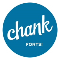
Logo set in Liquorstore (Chank). Click to enlarge.
The Minneapolis Egotists can be praised for buying local, usingLiquorstoreby native son Chank Diesel. They could have also gone with the more sophisticatedRefrigerator Deluxeby Mark Simonson of St. Paul, but Liquorstore was inspired by hand painted signage in the area, so it's hard to get more legit than that. The praise is slightly diminished by their rushed "10,000", set without tighteningEngravers Gothic's tabular '1'.

Logo set in a modified Gotham (H&FJ). Click to enlarge.
The Houston design is quite a clever tribute to its city. AGotham'S' is swapped with NASA's "worm", in a subtle reference to Houston's Space Center. It reminds us how a simple change can transform the feeling of a typeface. They need some kerning help, though — that third 'T' is looking awfully lonely.
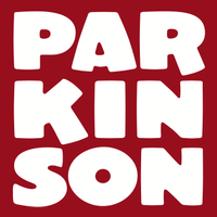
That's my brief take. Of course, a lettering veteran like Jim Parkinson, with scores of newspaper logos under his belt, would have more intelligent things to say about these. I'll ask him to chime in.
Update (Dec 29, 2010) — Ben Pieratt is partially responsible for these designs, which explains the similarities with the BCA identity.
See also:
David Jonathan Ross and Cyrus Highsmith's 3D logo work for Fortune
How to apply a layered shadow to webfont text