U.S. cable network Comedy Central started the new year with a new logo and on-air identity created by thelab. While it was received with the usual angry mobs and mockery that seize on any high profile rebranding, there were many, including the jaded voters and commenters at Brand New, who saw it for what it is: a subtle, clever, flexible ID that demonstrates Comedy Central's newfound confidence and maturity. A logo doesn't have to be "funny" to show that the company has a sense of humor.


Add the symbol to anything and it becomes Comedy Central's.
The symbol is a play on the copyright symbol, and it's often used that way, tagging the top right corner of words (like show titles) and images (like Jon Stewart's head).
The accompanying typeface isBrandon Grotesque, one of the most popular releases of 2010 (currently #1 at MyFonts, beating out Helv!), though we won't really start seeing a lot of it in the wild for a while.
I congratulate thelab for passing on more obvious and safe choices likeFuturaorGotham, which would look great too, but would have made the identity less original in the current design climate. They wisely avoid Brandon's lowercase entirely. Its shapes and low x-height are what give the face its 1920s–'30s appearance, and that wouldn't be quite right for the brand. The caps are more neutral.

Comedy Central started using Brandon Grotesque in Fall 2010 for promos like this one. It's a great type choice for a rally, but the poster designers botched the spacing pretty badly (see "SANITY").
Brandon first appeared in Comedy Central on-air promos a few months ago and was used for their (poorly kerned) Rally to Restore Sanity branding. It was introduced with the new logo and complete identity package this month and the usage is more consistent.
The identity really comes to life in the introductory reel which Doug Jaeger and Kristin Sloan describe well in their feature at Motionographer:
While some may find this mark to be too serious, boring, or too similar to other symbols, as it acts and behaves on every beautiful back-lit screen, it shows its unique personality. As it animates, it pukes, spins, and explodes with energy. It is frenetic. When it presents its full name — with the word central upside down and backwards — it tips its hat to slapstick heroes.
Motionographer's page has a high quality embedded video of the reel. You really must go there and watch it (about halfway down the page).
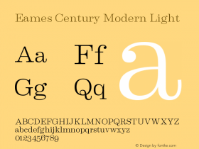
It's more than motion that makes this identity work — it's the pairing withEames Century Modern, a serif family with vitality and charm, and even a sense of humor of its own (though maybe only type geeks are aware of it). Erik van Blokland's design for House Industries has an amazing flexibility. I've seen it in sober annual reports and playful '70s throwback flyers. thelab deployed Eames Century with almost giddy glee here, filling the TV screen with paragraphs of it, using its exuberant italics and the extremes of its weights. Doing this work must have been a typographer's dream. It's certainly this typographer's delight to view it.