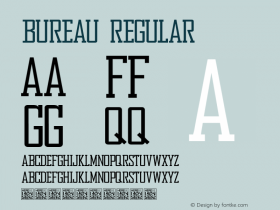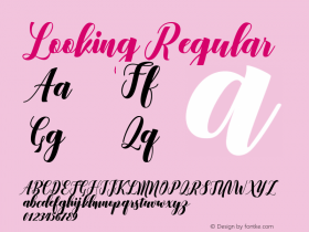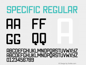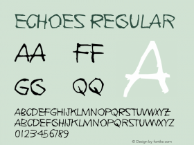

Source: http://www.fontbureau.com.License: All Rights Reserved.
Salvo SansandSerif(originally called Boomer) were commissioned by the AARP (American Association of Retired Persons) for their publications and other branding.
A meeting of the Society of Publication Designers reunited Cyrus Highsmith and Courtney Murphy. Their previous collaboration had been on the award-winning redesign of Sunday Independent. This time it would be for a triple feature: AARP The Magazine, AARP Bulletin and AARP Segunda Juventud.
The old choices were "too safe," Murphy noted. Needing to get with the times and align with the mood of their readers, they were looking to re-invigorate and energize their look. Early sketches of a lively typeface with slabs soon unfolded into a large family of serif and sans serif typefaces that could create specific palettes for each distinctive publication. The success of Salvo Sans and Salvo Serif echoes Murphy's design philosophy: "The right words draw people in, but on a subconscious level the typeface does that first."

Source: http://www.fontbureau.com.License: All Rights Reserved.

Source: http://www.fontbureau.com.License: All Rights Reserved.

Source: http://www.fontbureau.com.License: All Rights Reserved.

Source: http://www.fontbureau.com.License: All Rights Reserved.

Source: http://www.fontbureau.com.License: All Rights Reserved.

Source: http://www.fontbureau.com.License: All Rights Reserved.

Source: http://www.fontbureau.com.License: All Rights Reserved.

Source: http://www.fontbureau.com.License: All Rights Reserved.

Source: http://www.fontbureau.com.License: All Rights Reserved.
