Last month, on Saturday, May 26th, the European Design Awards 2012 Ceremony was held in Helsinki in the 80-year old movie theatre Bio Rex, widely regarded as a landmark of Finnish architecture. The best designers from all corners of the continent gathered to recognise and reward their achievements of the previous year. Gold and silver award winners were invited to collect a trophy and/or a diploma on stage during the ceremony. The European Design Awards celebrate the best in graphic design, illustration and digital design in Europe. With participants from 34 different countries (from Iceland to Cyprus and from Russia to Andora) and judged by editors from 15 prestigious design magazines from across the continent, receiving a distinction in the ED-Awards is a true reason for celebration.

This joint effort is open to all designers living or working within Europe. Designers in Europe may also submit work done for clients outside Europe, making the ED-Awards a comprehensive and truly pan-European competition. Entering the ED-Awards allows designers to publicise their work for an international audience. As the ED-Awards are based on a network of design media, i.e. the means of communication themselves, they receive the best coverage available in the design awards field. Silo based in The Hague, The Netherlands, won Agency of The Year, and the book decodeunicode – The Characters of the World was proclaimed Best Of Show. Amongst the entries accepted in the 33 categories, The FontFeed is of course most interested in the winners for the category 26. Original Typeface.
Gold Award


Gold Award|Abril
Agency | TypeTogether
Designers | Veronika Burian, José Scaglione
Conceived by TypeTogether specifically for intensive editorial use – whether it be printed newspapers and magazines or digital media – Abril is a font family of two worlds. The titling weights are a contemporary re-imagining of classic Didone styles. Although the characters display a certain neutrality they have a strong presence on the page, catching the reader's eye with the controlled tension in their curves, a good colour and high contrast. The typefaces feature typographic niceties such as ornaments, borders, special dingbats and alternate characters, offering propose a broad palette of possibilities to the designer.
The text weights however are inspired by both 19th century slab serifs and scotch roman types. They are consistent with the headline styles, appearing at first glance to have the same shapes but with lower contrast. In reality the letter forms of Abril Text were engineered from scratch. Thus the perfect colour, texture and overall width were achieved to allow comfortable use of the typeface in the most challenging environments for continuous reading, such as newspapers. This also makes it particularly well-suited for pocketbooks and magazines. Abril competes, in terms of economy of space, head to head with some newspaper classics such as Utopia or Nimrod, but featuring a more contemporary look and feel. Unlike them, it includes a full set of small caps, numbers and punctuation.
Abril consists of 8 text styles and 12 display styles, each containing the standard TypeTogether character set that supports over 50 languages including those from Central and Northern Europe.
Besides winning Gold at the ED-Awards 2012, Abril was selected for Tipos Latinos 2012 and the Bienále Brno 2012.
Kerning by Radek Sidun.
Silver Awards
Digital Alphabet in Stone – Dom Hans van der Laan/Autobahn 2011 from autobahn on Vimeo.

Silver Award|Digital Alphabet in stone
Agency | Autobahn
Designers | Dom Hans van der Laan & Autobahn
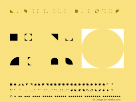
Dom Hans van der Laan (Leiden, 1904–1991) was a Dutch architect and Benedictine monk. After only a few years of architecture study Van der Laan developed a system of ratio principles based on the theory of the plastic number, which he invented. Using this theory Dom Hans van der Laan not only designed buildings, he also developed a typeface based on the Roman carved stone capitals used in the first century AD. This exclusive typeface has now been modernised and digitised by Autobahn. The complete font family contains four members: the basic figures from which the letters are created, a version with guides and contour lines, the regular font and the typeface showing the axes. By digitising this typeface, cutting letters in stone is simplified as it enables stonemasons to print directly onto a medium. It saves a great deal of time because the letters do not need to be drawn by hand anymore. Modern techniques, like milling and laser cutting, are now possible too.


Silver Award|Pramen Sans / Pramen Slab
Designer | Vojtech Riha
Bronze Awards


Bronze Award|Corporate type system for the new Berlin-Brandenburg International Airport "Willy Brandt"
Agency | xplicit GmbH
Creative director | Alexander Branczyk
Designer | Georg Seifert
xplicit developed an extensive typeface system for the corporate identity and passenger guidance system of the new Berlin-Brandenburg International Airport "Willy Brandt". The complex type family was created in collaboration with Georg Seifert on behalf of brand management agency Schindler Parent Berlin. It comprises a serif and sans serif component, display and office variants. Optimised versions for frontlit and backlit signs were specifically created for the passenger guidance system designed by Moniteurs Berlin. In addition to the Latin alphabet the type system supports the Cyrillic, Greek and Hebrew scripts. Berlin-Brandenburg International Airport "Willy Brandt" is the largest transportation project under construction in Germany and currently the largest airport construction site in Europe.


Bronze Award|Medien
Agency | Nouvelle Noire
Designer | Anton Studer
Because cross media projects are increasingly becoming the norm visual communication is not limited to print anymore. A wide range of media is used to communicate, yet type still is one of the key elements in communication worldwide. This means typefaces have to equally work well in very diverse situations. The emergence of webfont technologies in 2009 has had a huge influence on the usage of typefaces in digital media. Thousands of typefaces were converted to webfonts, even though many were not fit for use on the web. As the name implies, Medien was designed to perform well in almost any media. Its basic structure is made to fit on the grid created by screen pixels, but this isn't noticeable when it is used in printed matter. This intentionally unspectacular typeface doesn't interfere with the act of reading. Examining the forms of Medien reveals references to other humanist sans faces like Adrian Frutiger's Frutiger or Syntax by Hans Eduard Meier. Meant for use in all types of communication, Medien works especially well in corporate communications and in online & printed magazines and newspapers. It was created by Anton Studer for his diploma work of the first MAS in Type Design at the Zurich University of the Arts.


Bronze Award|Permian Typeface for the city of Perm, Russian Federation
Designer | Ilya Ruderman
In 2011 the city of Perm became the first Russian city to have its own, unique typographic identity. The idea for creating a typeface for the city came from Artemy Lebedev, then art director of Permian Design Centre; a city typeface to give a unique and recognisable identity to the wayfinding system, the city identity, promotions for city events etc. Ilya Ruderman quickly went beyond the original brief of designing only one sans serif family, producing a co-ordinated system consisting of three different typefaces based on one graphic concept – combining calligraphy and constructive design of the character contours. The resulting sans serif, serif and slab serif designs all come in regular, bold and italic styles. Although somewhat reminiscent of the classic Gill Sans, the humanistic sans is a fully original typeface, recognisable for its straightforward shapes, delicate serif-like constructions, and slightly slanted contrast. The serif variant is primarily intended as a text typeface, and the slab serif version can be used in both ways. Nonetheless all three versions work as well as text faces as they do in display applications.


Bronze Award|The Written Garden
Agency | xplicit GmbH
Creative director | Alexander Branczyk
Designers | Alexander Branczyk, Annette Wüsthoff
The Christian Garden is the latest manifestation of Berlin's Gardens of the World recreational park area. Located in the centre of this garden a quadrangular building is made solely of letters. Eleven lines tall with each letter being 33 cm in height, the structure has an edge length of 31,40 m. The building is composed of texts from within the Christian and occidental culture which form an ambulatory in the tradition of medieval cloisters. The challenge was to design a typeface that would support itself as a wall. At least 6 vertical stems per running meter were required. In addition the grey value had to remain a constant as possible, regardless of the amount of text per line. Alexander Branczyk is also responsible for the lettering and typesetting of the sixteen mural segments that form the building. With up to three alternate glyph variants a homogeneously woven textual structure has been generated, which distributes the load evenly onto the ground. The varying number of letters per line prevents single lines from looking compressed or spaced out. Up to three alternating forms of each letter (capitals, lower case letters-and special forms) create a lively and organic appearance with little repetition.
Header image:Abril in use in Dutch magazine Margriet
