
Source: http://www.wikipediaredefined.com.License: All Rights Reserved.
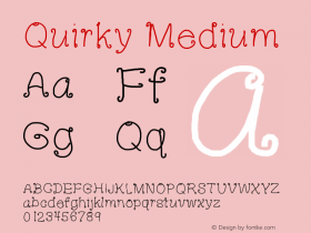
The Lithuanian studio New! got a lot of attention this month for their Wikipedia redesign proposal. And they got almost as much attention for the typeface they chose to describe the project: FF Schubuch Süd, a revival of a mid-20th century German schoobook typeface. Many commenters said they were thrown off by the font's unusual capital 'I' that resembles a 'J'.
So what's the story with this crazy 'I'? The answer lies in handwriting. The letterforms in the FF Schulbuch family are derived from the styles of writing that children learned in various regions of Germany, in the same way that the type in English books for young readers often has simplified, handwriting based forms, like a single-story 'a'.
So was FF Schulbuch Süd a good choice for this project? I give them credit for trying something new (not Helvetica), but the answer is probably no. The 'I' appears early and often in the proposal, becoming a noticeable distraction for most readers. I would have gone with FF Schulbuch Nord which has much of the slightly quirky Neo-Grotesk style but more conventional forms. Or they could ask FontFont for a customized Süd with a standard 'I'. That's the glyph FontFont should offer as a default anyway.
For the Wikipedia brand itself, the studio chose Maiola, an underused typeface inspired by the dynamic and angular style that characterizes early Czech design. All other Wikipedia text is in Arial.

Source: http://www.wikipediaredefined.com.License: All Rights Reserved.

Source: http://www.wikipediaredefined.com.License: All Rights Reserved.

Source: http://www.wikipediaredefined.com.License: All Rights Reserved.

Source: http://www.wikipediaredefined.com.License: All Rights Reserved.