
-
Diergaarde Blijdorp (Rotterdam Zoo)
Source: http://www.diergaardeblijdorp.nl.License: All Rights Rese
-
感谢不只是吸引的投递在过去,每当你创建一个网站或者网络应用的时候,能够让你选择的字体总是少得可怜——Times和Arial(宋体)

-
Excellent Documentary Marred By Typographic Anachronisms
The best way to tick off a graphic designer cum typography blogge

-
Source: http://www.wright20.com.License: All Rights Reserved.Wrig

-
Apple Supplier Responsibility Website
Source: http://www.apple.com.License: All Rights Reserved.The new

-
Timberland WomenTrade Gothic and Neutraf
-
就像是比较黑体和宋体,想要发现两个不同字体间的细微差异是挺不容易的。举个例子:未经训练过的眼睛,是很难看出Helvetica和Ar
-
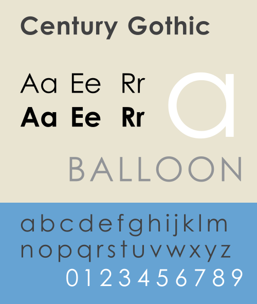
据美联社27日报道,美国威斯康星大学绿湾分校已将学校电脑打印系统里默认的Arial英文字体换成了世纪哥特体,校方表示,虽然这只是一点小小的变化,却可以使学生在打印文件时节省不少墨粉钱。该学校计算机主任戴安妮·布鲁赫维克表示,使用这一新的字体,至少能比

-
Photo: Florian Hardwig. License: CC BY-NC-SA.Photo: Florian Hardw
-
正如Mark Simonson所言,Arial字体就像一种寄生虫,并且它毁灭了它的寄主Helvetica字体。随着Windows操作系统在中国的普及,两个可悲的字体标准被竖立起来,无衬线字体使用Arial,衬线字体使用Times New Roman。也许是由于Arial被置于字体选择栏的顶部,它被选择的频率