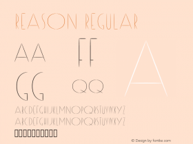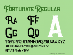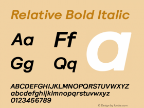
Discovering the winners of the TDC2 Certificates of Excellence in Type Design is always exciting, yet it bugs me that the Type Directors Club of New York limit their gallery to a simple sample image per winning typeface. We can see for ourselves that the designs are indeed beautiful and well-done. Personally though I'm also eager to find out some background information about the typefaces; what the motivation of the type designers was, if the faces were designed for specific purposes or with specific constraints in mind, what kind of research went into their creation, how that resulted in their final form, etcetera.
Fortunately, one can always look around and ask. I gathered some background information and samples – directly from the designers or from their respective websites – which I'd like to share with you. It's not as thorough as I wanted it to be, and a lot of it is (restructured) existing texts, but I hope you will appreciate the wee look under the bonnet/hood. Enjoy.
Klimax Plus
Ondrej Jób| Typotheque, The Netherlands
To call Klimax a striking design is something of an understatement. This display typeface meant for use in very large sizes comes in the two weights Plus and Minus – at both extremes of the weight scale – with matching italics. They are optical opposites, but both share similar metrics and kerning information, so they can be easily interchanged in a body of text without significant changing its length. Klimax Plus has linear counters and white spaces that reveal the inner construction within its massive black character shapes, a solution reminiscent of Fedra Sans Condensed Black. Their thickness perfectly matches the monolinear strokes of Klimax Minus.
The stroke ends of the true italic are curved, with protruding terminals that lend the design a softer and more decorative feel with calligraphic overtones. The small caps are even more massive basic geometric shapes without counters. Although their design pushes the concept to the extreme, in most situations and in context the letters are still sufficiently recognizable. Klimax Plus puts a welcome alternative spin on the persistent trend of extremely black display faces.
Nebulon
Carl Crossgrove| USA
Nebulon has a pronounced architectural, crafted quality to it, like lettering chiselled in stone. With its sturdy yet soft shapes and pointed finials it almost looks like an intermediary stage between Danish type and stylised pre-Columbian ornaments. Some characters subtly hint at the work of Stefan Kjartansson and Morten Olsen, yet the overall impression is very different and original. Here's what Carl has to say about the design:
Nebulon is a "futuristic" sans. Since the term "futuristic" is so loaded and relative, I accept that in this case it will also carry connotations of mid-20th-century science-fiction futurism and other retro associations. Nebulon's superelliptical shapes refer to Eurostile, which at this point seems to have its own retro associations. Nebulon updates the square, wide sans with more minimal structure, less Grotesk influence and more horizontality. It also tries to contribute to the crowded genre of square sans designs with a more organic, biomorphic feel, and a few exotic details. Note that a slight diagonal stress lurks in the bowls. Many other ingredients are distilled into Nebulon, so it's something of a hybrid, but as with all my designs, it's not a direct derivation from anything in particular. One formal theme that carried through from the beginning is that of a superellipse, with smaller superellipses subtracted from it, as in e, a, s, c. While this makes for an enticing conceptual starting point, much had to be changed and discarded to enable it to gel as a typeface. This design was surprisingly difficult to finalize! So many disparate ideas were at odds with each other, and at many times it just fell apart. Only by continual distillation and removal of elements did it finally find focus. Nebulon can serve in small passages for text, but it is a display design, one I think will be most useful for packaging, identity and advertising with a technical or futuristic angle. Alternate glyphs allow for more conventional or more futuristic variants.
OPTICA Normal
Manuel Guerrero| Blue Typo, Mexico
OPTICA Normal is the most insane type design I've seen in a very, very long time, possibly ever. I don't know whether to love or hate it – I get both a splitting headache and the giggles trying to figure out the words. Yet the fact that this actually happens makes me admire it even more. The typeface consists of geometric characters created by flipping the slant in a fixed pattern of diagonal lines. This optic game creates almost subliminal word images within the pattern texture. Theoretically those should become legible by analysing the line directions, but frankly when trying that it only becomes worse. I personally found the best way is to relax the eyes and let them go slightly out of focus, because if you try to hard you just go completely bonkers.
OPTICA Normal is a tribute to the Colombian artist Omar Rayo's optical art, and was featured on Typographyserved.com. The designer warns that it performs better at large sizes. No, really? :D ;)
Orbe
Rui Abreu| Fountain, Portugal
I recently had to add FontShuffle 1.1, and was a bit at a loss which classification to assign it to. Rui Abreu describes his design as a blackletter font which personifies the essence of Portuguese calligraphy. Orbe is a decorative titling face, with numerous flourished details recalling an exotic atmosphere. The high contrast between thicks and thins, and the balanced white spaces result in a pleasant rhythm and a nice texture in longer text settings.
Its name – which is Portuguese for "orb" or "globe" – evokes the beauty and consistency of enclosed shapes that naturally appear in calligraphy. Orbe's unicase characters – a mix of lowercase and uppercase – come across as fluid, light and spontaneous. It seems as if the uppercase forms of some letters gradually evolved to lowercase forms as a result of the gesture of hand writing. This is the reason why I would be tempted to categorise his design as a mix of blackletter and uncial.
Adios Script
Alejandro Paul| Sudtipos, Argentina
Adios is again an impressive ligature-and flourish-rich tour-de-force by Alejandro Paul. It was designed directly on the computer, and is a demonstrative idea of using contextual alternates to bridge traditional calligraphic forms with modern tattoo aesthetics. The technology in this case certainly helps the font's organic and distinctively human appearance. More Paul for your packaging.
Montague Script
Stephen Rapp| Veer, USA
While most brush scripts take their cue from mid-twentieth century samples, Montague Script is a fresh, contemporary alternative. It comes directly from lettering written with a #3 sable brush on smooth vellum and is digitised with the same sensibility a lettering artist writes with. Montague reflects a dynamic interplay between form and rhythm not usually associated with type. Words suggest a baseline, yet are not bound by it. Letters vary in size, connect smoothly, yet break that connection purposefully as the scribe does intuitively. Beginnings, endings, alternates and ligatures come in as needed while you type. Many more alternates are available in the glyph palette of most current graphic software. Exuberant swash versions of upper and lowercase letters, as well as ligatures can be accessed through both the type and glyph palettes.
Next:The Text Faces
Header image:Adios Script
