The 5th Typophile Film Festival premiered one month ago at Design à Trois, a three night event exploring rock poster design, book cover design, and type design, organised by Portland AIGA. One of the highlights actually came even before the very first item on the program hit the screen. The opening titles have become their own thing, something the typographic community looks forward to. The blurb for this year's sequence reads:
Lovingly hand-crafted by BYU design students and faculty, the 5th Typophile Film Festival opening titles are a visual typographic feast about the five senses, and how they contribute to and enhance our creativity. Everything in the film is real – no CG effects!
For five years in a row now the opening titles were produced by Brent Barson, a professor at Brigham Young University and fellow alumnus of Typophile's Jared Benson and Joseph Pemberton. The first year quite literally, as he was assisted solely by the Prelinger archives on Archive.org. The second and third year he had help from Mike Saltsman (cinematography & 3D motion tracking), Chad Smith (3D models), and Wynn Burton (closing credits), who was a BYU student at the time. Last year though, Eric Gillett – who teaches the Visual Arts 441 / BYU senior class, and knowing that Brent usually did everything by himself – suggested the students help on Typophile Film Fest 4, with him in more of a supervisor/director role. They were able to handle a much greater concept and the heavy production because of the students, who were directed on the story, writing, and storyboards by Eric Gillett and Linda Sullivan. And it paid off – the 4th Typophile Film Festival opening sequence won a coveted One Show Silver Pencil.

As I enjoyed last year's interview with its creators on Unzipped so much I decided to do it again for this edition. Besides Creative Director & Faculty Mentor Brent Barson I also interviewed the aforementioned Wynn Burton, "a really helpful ex-student who loves type, photography, and stop-motion", and Analisa Estrada, one of the students who collaborated on the project. Brent explained to me that "unlike last year there was not such a clear leader this time around". We felt bad excluding any of the others because according to Brent the work was so evenly spread around, but frankly a three-way interview is about the most I could manage. I also asked a couple of questions to Micah Dahl Anderson, who just like last year composed and performed the marvellous score for the titles.
Typophile Film Festival 5 Opening Titles from Brent Barson on Vimeo.
The new opening sequence is a change of pace compared to the previous one. How did the concept for this one originate?
BRENT BARSON| It was Wynn who first floated the idea of the 5 vowels, and the symbolism of the number 5 – this being the 5th Typophile Film Festival and all.
I think one of the main reasons the last (4th) Typophile Film Fest credits were so successful is because the story, the retelling of a man's life, was so universal. That led me to think of the five senses, which is another shared human theme. Not to mention the fact that it lent itself so well to 5 separate "worlds" or chapters, which would allow us some diversity in visual concepts. Once we knew we wanted to do the senses, it was very obvious that this needed to be a tactile, sensory, real, hands-on process.
We gave Joe and his team at Punchcut/Typophile several options to choose from, but the clear favorite from the very beginning was the 5 senses and tangible typography idea.

From left to right: John Jensen, Jessica Blackham, Regan Fred Johnson, Meg Gallagher, and Colin Pinegar

Creative Director & Faculty Mentor Brent Barson (right)

From left to right: Analisa Estrada, Jessica Blackham, and Deven Stephens
This is the second time you enlisted students to produce the opening titles for the Typophile Film Fest. As this was a new group of students, did you have to start again from scratch, or were you in some way able to build upon last year's experience?
BRENT| We started from scratch with a completely new group this year; but the success of the last project made it easy to recruit talented new student designers. This project was different from the last one, in that it was never part of a formal class. Everyone who participated did so completely voluntarily, for the love of type and motion!
ANALISA ESTRADA| I heard about the project through an e-mail and some word of mouth recruiting. We're a really small department, so it was general knowledge that a big project was underway. The success of TFF4's titles was definitely incentive to get involved, although somewhat intimidating! I had more practical reasons to stay out of it – time-sucker, no money, no class credits – but this was a really unique opportunity. At the end of the day, the only incentive to keep working was genuine creative satisfaction, and that thought was very refreshing.
WYNN BURTON| I had actually been a student of Brent's a few years back and was lucky enough to be in a position where I had time to devote to this. Brent mentioned to me that he was getting people together to work on TFF5, and I jumped at the chance – I knew a few of the designers that worked on the previous opener, and saw how much fun they had had, and how amazing it turned out. I was extremely excited about working on a piece where the sole purpose was creating something beautiful and conceptual. I definitely heard "wait – you're doing what? for free?" a lot in the process, but it was the sort of project that you just wanted to do because at the end of the day you felt like you had been able to tap into the very core of yourself as an artist on such a personal and deep level.

Olivia Knudsen attempts to get the red plexiglass 5 to stay on the brain.
Once the theme (the five senses) was determined and Punchcut/Typophile had approved the initial concept, how did the project evolve from there?
ANALISA| Brent split us up so that some were working on storyboards and some were experimenting with animation and construction. Since we decided right away that we would only use physical type, we were constantly aware of limitations, but wanted to push the medium as far as possible.
For storyboards, we had a few initial ideas of using a character that experiences each sense, to make it more of a literal story, but we thought that may be too constricting. Using a quote to characterize each sense seemed like the most interesting direction typographically, and a really solid way to make the concept accessible to the audience. We made word lists, read books and articles about the senses, and were able to write/find 5 quotes that said something profound or memorable about each sense. The animation ideas were a combination of random ideas we loved – like slow motion jello letters – and ideas that were developed specifically for the words in the quote – "conjures" made from smoking incense cones, "adds dimension" being pressed into a block of clay. After the initial storyboards, we had to whittle down all the ideas quite a bit, sometimes discarding things that would be really stunning in favour of better pacing and storytelling.

Analisa Estrada and Reeding Roberts prepare to shoot the scent letters out on the grass at night. The bugs were fun.
How was the division of work? Did everyone work on different aspects of the whole sequence, or was every sense assigned to a dedicated group of students?
BRENT| The overall division of work fell almost perfectly along the lines of who was going to go on an internship in New York*, and who wasn't. Whereas everyone was involved in the concept, storyboarding and preproduction phase, the first year BFA students had to leave as the rest of us started the production phase (getting materials, setting up our studio, preliminary shooting tests). It wasn't planned that way, it's just that the storyboarding and writing took longer than anticipated.
| (*) | Every year the BYU Graphic Design area sends up to a dozen junior-year students to intern at high-profile firms and studios. The most common placements are Martha Stewart Living, Johnson and Johnson, Graphis Magazine, the Valentine Group, Design MW, Pentagram, Aveda, Studio Case, and The Moderns. Some of these students end up working full-time at the company after graduating, and some don't even wait to graduate, but stay in New York. There is a large and successful network of BYU graphic design graduates in New York City, which makes this internship program a perpetual success. |
The goal was to have two teams and sets going simultaneously, but what usually happened was that everyone available worked on one scene at a time, because they were so time and labour intensive. If we had extra people (which usually meant more than three or four) and enough lighting, then we were able to shoot another scene in another room. We started animation on the foam "symphony" letters first. The order of the scenes was determined by whether we had all the type and materials necessary to shoot the whole scene. Occasionally one of us would have "homework", and would have to put in extra extra hours at home to finish construction of a word or set piece.

Deven Stephens kerns on purple fur like an old master.
The previous TFF opening titles were more digital than one would suspect, and involved the students having to learn motion design and After Effects. This one however looks quite literally hand made. What new skill sets did you have to learn this time?
WYNN| Short answer? All of them ;)
Longer answer: I had been doing product photography for a while before this project, and so I was actually really comfortable with the DSLRs that we were using and the lighting and set-ups, but in all honesty, that's where the comfort zone ended. I've done motion graphics for a while, too, but I had never really done stop motion on this scale before (and in particular had never used Dragon Stop Motion), so that was a bit of a learning curve.
We (mostly Brent) definitely had to learn the ins and outs of laser-cutting, and the structural characteristics of Jello and squash… For me, I think the area I grew the most in was planning and directing the shoots. This is the first project I've been involved with where it's not just me doing the shooting, so it was a bit of a challenge for me to make sure the shot style and quality was consistent across such a big project.
And I think we all learned a ton of patience… kerning on purple fur apparently is no picnic (right guys?).

Halfway between a sans and a swashy script.

Analisa shooting the Beauty animation, with intermediary stages waiting on the floor.
ANALISA| I learned a lot of fun, random skills that may be useless in the future, like cutting letters out of clay, constructing a foam core turntable, and composing a type lock-up over a lacy tablecloth. I agree with Wynn's comment on kerning over weird surfaces – not much that can prepare you for that.
On the more practical side, learning how to use the stop motion software and a little bit about cameras and lighting from Wynn was a plus. I was also responsible for the "Beauty" swash animation, and it was definitely a learning experience animating that transformation. I had done a few custom type designs for student projects before, but animating a simple sans into a swashy script was a whole new world. The animation had to be drawn frame by frame in Adobe Illustrator, and we had the frames cut out of red plexi. Then we set and photographed each frame. The most beneficial part, however, was learning how to solve problems! There were a few sequences and transitions that caused unforeseen issues, and they required a lot of thought and work to pull off.

Wynn Burton carefully places a red "Y" on the top of the stack for the "Symphony" animation.
Although they could make them perfectly smooth, the animators at the famed Aardman studios purposely leave finger prints in the clay figures, as some kind of statement that everything is indeed real and made by hand. Did you look for ways to make it obvious that no CG was involved in producing the opening sequence?
BRENT| I wouldn't say we looked for ways to make it obvious – we were all just imagining stop-motion type and slow-motion sequences that we thought would blow peoples' minds. It was all about the sensory feast, and what influences human creativity. We thought that the processes we used did look inherently handmade, and we hoped they would result in wonder and amazement that the images were real. On that note, the sense of touch was one we definitely wanted to feel like it was crafted by human hands. We wanted a living, breathing, tactile scene. Overall, we just wanted to surprise people with what can be done with cameras and real objects. We chose the methods and materials that we thought best embodied the meaning of the word or sense.
WYNN| Just to echo Brent's comment on this, I think that by virtue of the process the whole piece looks inherently handmade. Now, that being said, our focus wasn't to create "something that looks handmade" so much as it was to create "something beautiful and amazing and – wait. what? It's all real?!" There were definitely scenes that called for a more organic human touch to them, but then again, we had access to some incredible resources and the combined ability to really knock some of the shots and animations out of the park. One shot that comes to mind for me is the Scent macro shots (plexi letters) – the feeling of the motion of that segment called for something really fluid and smooth, so that the focus could be on just how beautiful and elegant these letters could be through the camera lens.
Was it a concern of yours that people might mistake some passages for computer generated imagery?
BRENT| We joked about it looking "too good" or "too awesome" when we were conceiving the visual ideas. It actually seemed funny at the time that we would be capable of creating something by hand and with analogue means that would appear as if it were computer generated. But at the same time, we didn't want people to think that it was simply created on a computer. So, yes, it was a concern occasionally.

Laser-cutting the Hampersand™.
The fact that everything is real meant you had to cut out actual three-dimensional letters in a lot of different media. What materials were used?
WYNN| A good chunk of the letters were from plexiglas. Most of the letters were laser-cut, but some (the metal LIFE type, for instance) was water-jet. Brent could probably give you a more authoritative list, but we used:
PlexiglasWood (painted and unpainted)AluminumFoamHamPotatoesKool-AidJell-O (Vac-u-form molded from wood)Squash (originally tried cheese)ClayIncense (about 150 cones)
I know I'm probably forgetting something, but that's a pretty good list.

Wynn Burton and Meg Gallagher painstakingly animate dozens of plexiglass letters for the "Scent" scene.
The advantage of working with computer generated images is that you have a lot more control over the process. I suppose working with real-life objects created a whole lot of real-life problems?
WYNN| The squash time-lapse segment was a serious pain, but I think that whole segment (from the incense smoke to the time-lapse) is one that I'm most proud of, personally. The original plan was to shoot the whole sequence with the 40D and make a seamless transition into the time-lapse segment, but when we got to the transition, we ended up needing the 40D and the camera rig for another shot so we had to switch over to the Nikon on a tripod. On top of having to match the angle, exposure, and lens distortion between different camera makes and totally different lenses (with no live preview in the software for the D80), we finally got the time lapse set up and running only to find out 24 hours later that we forgot to check to see if the computer was scheduled to shut down. We ended up losing a day's time-lapse and having to reset all the squash letters with a backup set we had, then having to rematch to the original transition all over again. I think the final segment was worth it, though!
BRENT| The incense cones from the scent "conjures" scene were obviously very fragrant, but what we didn't consider was that they are full of oil that stains fabric very quickly and permanently. The green fabric we had them on stained easily if you left a cone on it for longer than a few seconds. So, we had to go look for some sort of sealant at a craft store, and ended up dipping every one of the 144 cones into fast-drying sealant for paintings. It worked!
When we were lighting every single incense cone, we had to leave the lighter on for so long that the lighter would melt. We finally found a metal zippo lighter, and I believe it was a barbeque lighter that wouldn't melt with the heat of lighting all 144 cones. The only remaining problem is that Reeding's house (where we filmed the incense scenes) still smells like Nag Champa.

"Ham for Typophile project. Do not eat! Thx. Brent Barson"

Frying letters.
WYNN| Probably the most fun shot was the "Hampersand™" shot, as Brent liked to call it. There's just something hypnotic about watching letters fry. And Deven was great, taking one for the team and biting the S for the plate shot. Who knows how long those letters had been sitting out beforehand.
BRENT| During the "touch" hand scenes, Deven's poor wife Michelle had to hold her hand still against the glass shelf, without ever moving much or taking it out of the upright position, for two and a half hours! Her hand kept getting whiter and whiter, because all the blood was draining out of it. She had to think of all sorts of exercises to keep it, and herself, from going to sleep.

Deven sticks some more purple clay type to his long-suffering wife's hand.
Trying to find a glue that would work for sealing the "drinks" plexiglass letters was one of the hardest things we encountered on this project. Both kinds of plexiglass adhesive that the plexiglass store gave us did not make the layers watertight (Kool-Aid tight), and this we discovered after gluing all six layers of a letter together, spending more than an hour on each letter. Deven found some random adhesive in his garage or somewhere, which ended up working, but was so toxic it would give him headaches, and he would have to stop and take breaks frequently. It took the efforts of Reeding, Deven and I all at different times, as well as several trips to the plexiglass store and laser cutter to get a finished set of letters. And, on the night of the Kool-Aid shoot, there was one small leak in the one of the letters, and we were racing against time to finish shooting, because we couldn't have red liquid leaking all over our white lacy tablecloth. I think it was all worth it.

Pouring Kool-Aid in a plexiglas "k".
For the lifting spiral transition between the "Seeing" scene and the "Hearing" scene, we knew we would need some extremely thin string or fishing line to lift the paper. I ended up using a strand of blond hair from my 7-yr old daughter Sophie, which worked brilliantly because it is so thin and clear. Now, whenever she watches that part of the opening titles, she says "That's my hair!"
ANALISA| I was really excited with how well the tablecloth flip went. We had a few scenes that we had very little or no control over how the action transpired, and this was the shakiest. There were quite a few backup plans and more backup plans for the backup plans. I believe the description on the storyboard began with "A miracle occurs…" and with a little old-fashioned trickery, it did!
BRENT| When Reeding was testing out different organic orange materials for the "memory" letters, he tried cutting (with a knife, by hand) some cheddar cheese letters, and set them up in front of a time-lapse camera. Days passed by, then weeks, then we started shooting, and the cheese still looked as fresh as the day it was cut and set in front of the camera. It refused to mold and shrivel up! Five months later, the preservative-laden "cheese" is still perfectly formed and coloured, although it's rock hard.
WYNN| In general there's a lot of stuff you don't think will be a problem until you actually get it in front of the camera. The Jell-O letters turned out to be a lot more problematic than we all expected, and like Brent explained getting "Kool-Aid tight" plexiglas letters took a lot of work (special thanks to all the gluers who figured that one out). Shooting/lighting on glass and water always seem to be more trouble than you originally envision, for instance. And some of it was physically taxing, too – you get sore when you're hunched over, animating in a 4″ square with a tooling needle for 12 hours. ;)
But like I said, it was all worth it. You can ask my wife – I was all giddy when I would bring home the dailies to show off to her…

Brent dropping some Jell-O letters

Reeding and Brent try to get the Jell-O to drop simultaneously.
BRENT| Few of us saw very much of our families or spouses while we were shooting this project, and my wife and kids would often come over to the building to bring dinner or just see me for a brief while. The building in which we shot the project, the Amanda Knight Hall, is a very old building, and students who have spent late nights there have many creepy ghost stories to tell. Unexplainable sounds, voices, etc. One night, when my wife Jill brought our kids down, after we ate dinner together, the kids (7, 4, and 3 years old) were running all over the second and third floors, screaming and yelling and having fun. I guess one of the student cleaning employees came by the building to do her nightly job, and when she heard kids' voices screaming and shrieking upstairs, she took off running because she thought there were ghosts! No cleaning that night.
How long did the complete production take?
BRENT| In total roughly five months from start to finished product. We started April 1 with recruiting the team, after which we had ideation meetings once a week for the remainder of the month. In May we had storyboarding meetings, once, sometimes twice a week, followed by full-time shooting (Mondays to Saturdays) from June 1 to July 13. Editing & post-production happened in three chunks: July 21-23, August 10-11, and August 18-26. Indeed, up until the last day before the premiere at "Design à Trois" in Portland, Oregon on August 27th 2009.

The team's awesome industrial design friend Casey Lewis looks over wooden letters that have just been sprayed with primer.
How were the typefaces selected?
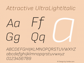
BRENT| Most of the type choices were based on the letters having characteristics that we thought would work well in the physical world to stabilize the type while shooting. For example, we chose Scout as our sans serif because it was a strong, non-traditional, non-Helvetica sans, that was square enough that it would be able to literally stand up on its own if necessary, when constructed out of wood or metal. We weren't able to use the thinnest weights, because of the limitations of cutting the letters out of brittle materials, and the risk of them breaking.
Dispatch was selected because it is an attractive, modern slab serif. Slab serifs were especially useful, because most every letter (at least the capitals) stood up quite easily, and are easy to keep on a straight baseline when flat.
We wanted to use Farnham because it looked so beautiful in the heavier italic weights, and we liked how it is elegant yet modern for a serif face.
Giza is so delicious and chunky, we really just wanted to be able to animate with a wooden purple slab-serif. It looked so puffy and friendly; it seemed perfect for the sense of touch. Plus it was very sturdy. I had to enlarge the counters and modify the outlines a little before laser cutting, to accommodate Giza Nine Five's tiny slots and close slab serifs.

Composer Micah Dahl Anderson proudly shows off the One Show Silver Pencil the BYU teachers and students and himself won for the 4th Typophile Film festival opening titles.
Just like last year the music beautifully complements the beguiling images. I briefly talked to composer and multi-instrumentalist Micah Dahl Anderson.
How did you get involved?
I'm guessing I was in mind for the music from the very beginning. I did the music for TFF4, and I did music for F is for Fail with Brent this summer. We had talked about concepts for Typo5 then. Brent gave me things he and others on the project really liked and wanted to keep; other music that fit well with the project. I always kept those in mind as I wrote, but it came down to writing something I liked, and Brent telling me to keep it or lose it.
How did you go about creating the soundtrack for the opening titles?
Well, I tried to get a different feel for each of the senses' scenes, while maintaining some sort of connection by starting and ending on the same theme amongst others. Each section had a built-in idea of where it needed to go. The "Taste" scene for instance had people physically frying the letters and pouring drinks. As it felt very real and organic – the whole piece did, but this part even more with the departure of stop motion – so it seemed to call for organic sounds like acoustic guitar, pizzicato strings, and a stripped-down drum set.
In what way is the soundtrack to this fifth opening sequence different from previous one?
It's less of a stand-alone piece than the last one I think. It more or less accompanies the visuals instead of helping them move along. The opening sequence TFF4 was more of a story so it called for a musical narrative. I think we could have made a stand alone "song" piece, but in the end decided on one that worked in stages instead. Also there is no electric guitar in this one.
The verdict
At first I was concerned that the new Typophile Film Festival opening sequence wouldn't hold up against the heart-breaking, devastatingly beautiful previous one. Unexpectedly, seeing the life of a human play out in type proved to be very emotional and had me as well as others in the audience in tears by the end. Thankfully the new opening sequence is a fresh start, a complete departure from this concept.
Instead of retreading the same motifs and pulling at the heartstrings, this one evokes an innocent sense of wonder and enchantment. The images look the part, and have the viewer amazed at how the type takes on a variety of physical forms, magically morphing and transitioning from one scene to another. Both the live footage and the stop motion images feel organic and are well integrated. The reverse deconstruction of the quotes is very effective – the separate key words appearing one after the other add a game element, leaving the viewer guessing what every completed quote will be.
Again the gorgeous score perfectly accompanies the images. Building on a recurring musical theme Micah introduces subtle variations and uses different arrangements for each of the five scenes. I particularly like how he – almost imperceptibly – musically punctuates key events, like adjusting the frequencies during the shrivelling of "memory", or the addition of atmospherics for the slow motion tablecloth pull. The final section with choirs and subsequent stripping down of the instrumentation beautifully rounds off the sequence.
| C R E D I T S | |
| Shot with a RED One, a Canon EOS 5D Mark II, a Canon EOS 40D, and a Nikon D80. Stop motion created with Dragon Stop Motion. | |
| Creative Director & Faculty Mentor | Brent Barson |
| Writing & Storyboarding | Brent Barson, Jessica Blackham, Analisa Estrada, Meg Gallagher, John Jensen, Regan Fred Johnson, Colin "The Pin" Pinegar |
| Construction, Paint & Glue | Brent Barson, Wynn Burton, Analisa Estrada, Meg Gallagher, Olivia Juarez Knudsen, Casey Lewis, Reeding Roberts, Deven Stephens, Brian Christensen (Brain Sculpture) |
| Animators | Brent Barson, Wynn Burton, Analisa Estrada, Meg Gallagher, Olivia Juarez Knudsen, Reeding Roberts, Deven Stephens |
| Cinematographer | Wynn Burton |
| Editing | Brent Barson, Wynn Burton, Analisa Estrada, Meg Gallagher, Reeding Roberts |
| Hand Models | Analisa Estrada, Meg Gallagher, Olivia Juarez Knudsen, Deven Stephens, Michelle Stephens |
| Original Music | micah dahl anderson |
The Typophile Film Festival 1 opening titles sequence.
The Typophile Film Festival 2 opening titles sequence.
The Typophile Film Festival 3 opening titles sequence.
The Silver Pencil-winning Typophile Film Festival 4 opening titles sequence.

