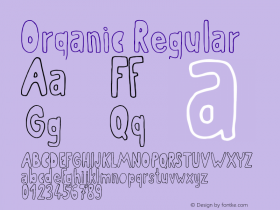
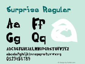
 The Massif typeface family, designed by Steve Matteson, is rugged yet refined – and distinctly organic. "It's my response to the uniformity and neutrality of so many sans serif typefaces being released today," says Matteson.
Matteson's inspiration for Massif came from the rocky features found throughout the Sierra Nevada Mountains. Glacial activity both polishes and erodes fissures, which contrast in texture creating distinct patterns of light and shadow. His initial drawings for the design include sketches of Half Dome in Yosemite National Park. "I tried to capture the Sierra Nevada terrain in two dimensional letterform designs," he recalls.
"The heavy weights have the most character about them," Matteson continues, "but I was surprised at how the light weights have their own delicate, twig-like feel. My daughter drew a little fairy balanced on the letter 'a' and it surprised me how sensible it looked."
With 12 designs, Massif's range of usage is deep and wide. its distinctive design traits, large family size, and extensive character-set make the design an excellent choice for a variety of branding, advertising and publication design projects.
The Massif family is available as desktop fonts from the Fonts.com, Linotype.com and ITCFonts.com websites. It is also available as Web fonts from WebFonts.Fonts.com.
To learn more about Massif check it out on fonts.com or new.fonts.com!

Allan Haley is Director of Words & Letters at Monotype Imaging. Here he is responsible for strategic planning and creative implementation of just about everything related to typeface designs.
