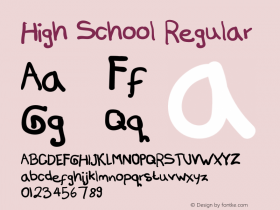
A type designer with Monotype Imaging, Terrance Weinzierl has developed retail designs, as well as custom treatments for companies such as Microsoft, Google, and Ubisoft. Two of Terrance's recent designs – JMC Engraver and Feldman Engraver typefaces – were released as companion fonts to Nancy Sharon Collins' new book The Complete Engraver. You can download them forFREEfrom Fonts.com.
 Terrance recently shared with us some insight into his type design practice:
Favorite text on typography
Karen Cheng's Designing Type found me at just the right time, when I was a beginner.
Personal design luminary
It's hard to narrow it down to just one person. I like the type from Gill and Frutiger, but I'm also inspired by the story of Frank Lloyd Wright and Goudy, continuing after devastation.
Favorite era of design history
At the moment, I love Art Deco and the decades surrounding it.
Learned to design type
I started to teach myself type design in college, but most of my training has been from Steve Matteson and other generous colleagues at Ascender and Monotype.
Design mentors
In chronological order: my mother, a toy designer; my high school art teacher Richard Guimond; my typography professor Michelle Bowers; most recently, type designer Steve Matteson.
Longest a typeface has taken to design
My hobby project with JMC Engraver and Feldman Engraver took two years (on and off the shelf).
Shortest time to design a typeface
I've made a few tiny, custom fonts that only had a few glyphs in them, so one day!
Favorite typographic resource
Typophile has a wealth of knowledge and arguments recorded. I think Twitter has taken over, though. Follow some type junkies and you'll get more links than you can possibly handle.

Habitually challenging glyphs to design
I find Greek lowercase difficult to draw. Italics too. The ampersand can be fussy. It took some practice to conquer the S's.
Favorite pursuits outside of type design
I enjoy movies and dining out quite a bit. I love Netflix. Video games have also been an enduring hobby, from the original NES up to my PS3. I'm also addicted to tech news, like The Verge. I put software launches on my calendar. I've cut back recently as type is taking more of my hobby time over.
Typefaces folks might know you for
Probably the Comic Sans Pro extension, if I had to choose. 99 percent of my work is on custom typefaces. I've spent a lot of time working on the Segoe design for Windows Phone and Windows 8. Most of my blood, sweat, and tears doesn't get seen in the retail market.
Favorite type classification to design
I haven't even drawn a design in many classifications yet, so it's hard to say, but I've been enjoying drawing brush scripts lately.
Percent of type design that's art vs. percent that's science
Difficult question. Maybe 80/20? Could you argue that a private press design is more artful than usual? Probably. Is the Bell Centennial typeface more scientific than usual? Probably.
Your typeface families that pair especially well
Try JMC Engraver and Feldman Engraver, and then ask me again in 10 years.

Common personality of your typefaces
The typefaces I've done that weren't custom are organic and sometimes wacky. I'm working on a serious humanist sans that you'll see soon.
Most underrated letterform or glyph
The pilcrow, or paragraph symbol, can be awesome. It's just not used very often anymore. Now, it's almost like a software Easter egg. 
Aspiring type designers should possess
Patience. Type design routinely requires a lot of patience. It may take a while to draw smooth curves, and there is a technical learning curve with building fonts. Have thick skin too.
What typeface classifications should they study?
I think the lessons in geometric sans serifs are important. The subtle tapers, overshoots, optical adjustments will apply everywhere. Study Old Style serifs to embrace detail variation. Look at calligraphy and script to see how writing instruments influence shape. Also, figure-ground relationships are very important.
Favorite medium to see your typefaces
I love seeing the Segoe, Droid Sans and Open Sans typefaces being used everywhere, even though I only contributed to those big projects. My favorite party trick is telling someone with an Android or Windows Phone: "I worked on those fonts."
Endeavors which hone type design skills
Drawing, not just type, but anything. Observing type in use. Setting type.
Most egregious typographic error in common practice today
I'd have to agree with Jim Wasco, script in all caps is nasty. Not using kerning when available is ludicrous.
Recommended online design resources
There are so many out there that come and go. I never have enough time to read everything. Ilovetypography.com is excellent, and I like Brand New.

Ryan Arruda is the Web Content Strategist at Monotype Imaging. Ryan holds a bachelor's degree in film studies from Clark University, and an MFA in graphic design from RISD.